TESTING
Usability Testing Scripts
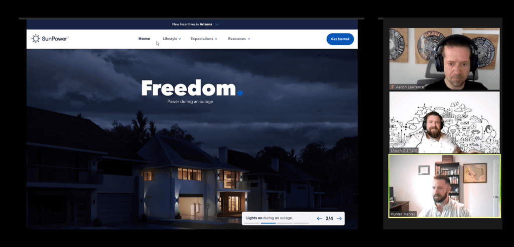
Why we test
Testing at every stage: Lean UX emphasizes the importance of validating ideas early and often, even before committing to development. This means conducting usability tests and/or other forms of extracting feedback to confirm you're on the right track.
Thinking like a scientist: Approach design with curiosity and hypothesis-driven thinking. Every design decision should be treated as an experiment that needs validation through testing.
Deciding like a lawyer: Make decisions based on evidence gathered from real user feedback, not assumptions. Just like a lawyer builds a case with solid proof, a designer should rely on user data to make informed choices.
Risk accumulation: By skipping testing, you're essentially taking on unnecessary risk, as you can't be sure your design choices and content aligns with user needs or their mental model. The more unchecked decisions you make, the higher the chance of creating a product that fails to meet expectations of our users and results for our business.
When we test
Always be testing (ABT): Testing shouldn't be a one-time effort. By setting a cadence of weekly or bi-weekly tests, you're consistently gathering user feedback to inform your next steps. It allows you to catch potential issues early before they become costly or difficult to fix.
Imperfect designs can (and should) be tested: You design does not be completed or polished to test it. In reality, even rough sketches, paper prototypes, or unfinished wireframes can yield valuable insights. It’s better to test early and make adjustments when the stakes are lower.
Testing at all stages: You’re right that testing should happen at every phase:
Concept level: Use simple paper prototypes to explore basic ideas and interactions.
Wireframe stage: Validate structure, flow, and functionality before visuals are added.
Visual stage: Test the look, feel, and final interactions to ensure the product is aesthetically pleasing and functional.
Iterate after changes: Anytime you introduce new screens or modify existing interactions, it’s crucial to test again. Small changes can have a big impact on the user experience, and testing helps ensure these adjustments are beneficial.
How we test
Tasks Testing
Ask your user to complete a task within the application, then watch and observe without offering help—unless they are truly stuck. Afterward, have them go through the task again and ask them to explain which content was confusing or brought them joy etc. This allows you to be a "fly on the wall" during the first walkthrough. You can also break up the session into multiple task scenarios to explore different parts of the experience.
General Usability Testing
Incorporates questions and prompts within the task, allowing you to observe & ask questions while the user navigates through each task.
GENERAL QUESTIONS EXAMPLES
Q. Is all the content on the screen what you expected?
Q. Is there anything missing that you were hoping to see?
Q. Is there anything confusing about this screen?
Q. What did you first notice when you landed on this screen?
Q. What do you think that “button” would do....
Q. Does this copy make sense?
Q. What did find the most easiest or valuable about the over-all experience?
Q. What would you do next...
This approach helps gather insights during the session and keeps things more conversational.
SETUP
Creating a Usability Script
1
Start with identifying the the scenarios you're going
to task people to do in your application?
EXAMPLES
• Enter a budget of $4,000 and find a travel trips to Tokyo
• Start a group chat titled "plant help" then send the group a message (you can write anything)
• Find a specific show called "Love is Beauty" and purchase 2 tickets for Saturday Oct 12 at 7:00pm
2
After defining your tasks, review the application's or prototype's workflow in detail. Examine the user interface, content, text, actions, and overall experience. Take note of any assumptions you're making about how users will interact with it. From there, create questions specific to each task that will help you validate the content, confirm usability or challenge the assumptions you're working with. These questions will guide your session.
EXAMPLES
Task: Enter a budget of $4,000 and find a travel trips to Tokyo
Q. Talk out loud, tell me what everything on this screen means to you.
Q. What would you expect to see on the Tokyo trip details page?
Q. Is there anything missing on thy Tokyo trip details page that you would like to see?
Q. How would you share this trip with someone?
Q. Was there anything confusing about this?
Q. How do you interpret (any message or text) you want to test?
Q. What do you think that "icon" in the top right is? And what would you expect that to do?
Task: Find a specific show called "Love is Beauty" and purchase 2 tickets for Saturday Oct 12 at 7:00pm
Q. Talk out loud, tell me what everything on this screen means to you.
Q. After you created the group where would you have gone to edit the group?
Q. How do you know if there are group members who are on the app right now?
Q. Would you want to be notified if someone messages within the group? If so, how?
Q. Where would you go to enable these types of notifications?
Q. Was there anything confusing about this?
Q. What in the task did you find most valuable or easy-to-use?
3
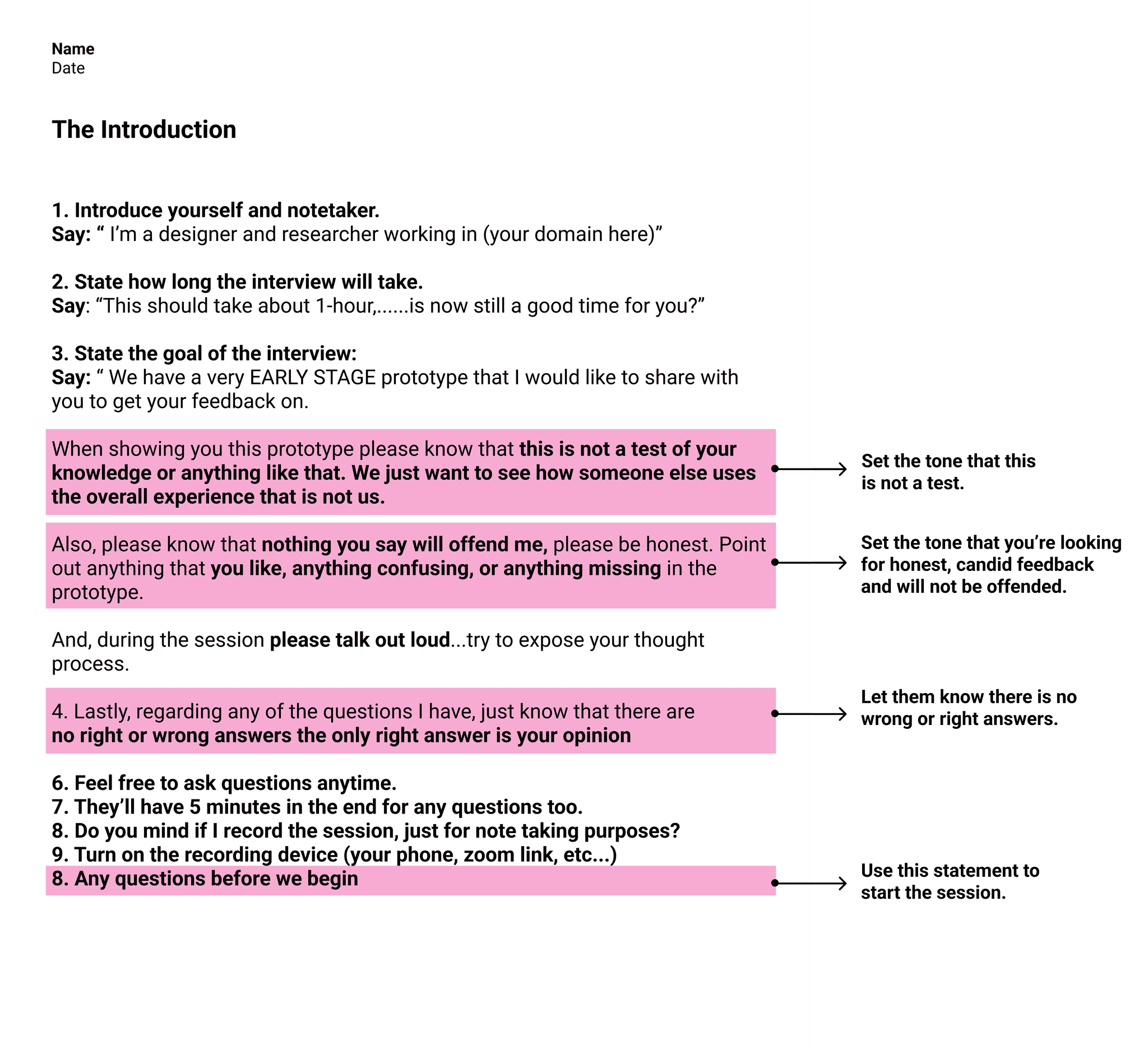
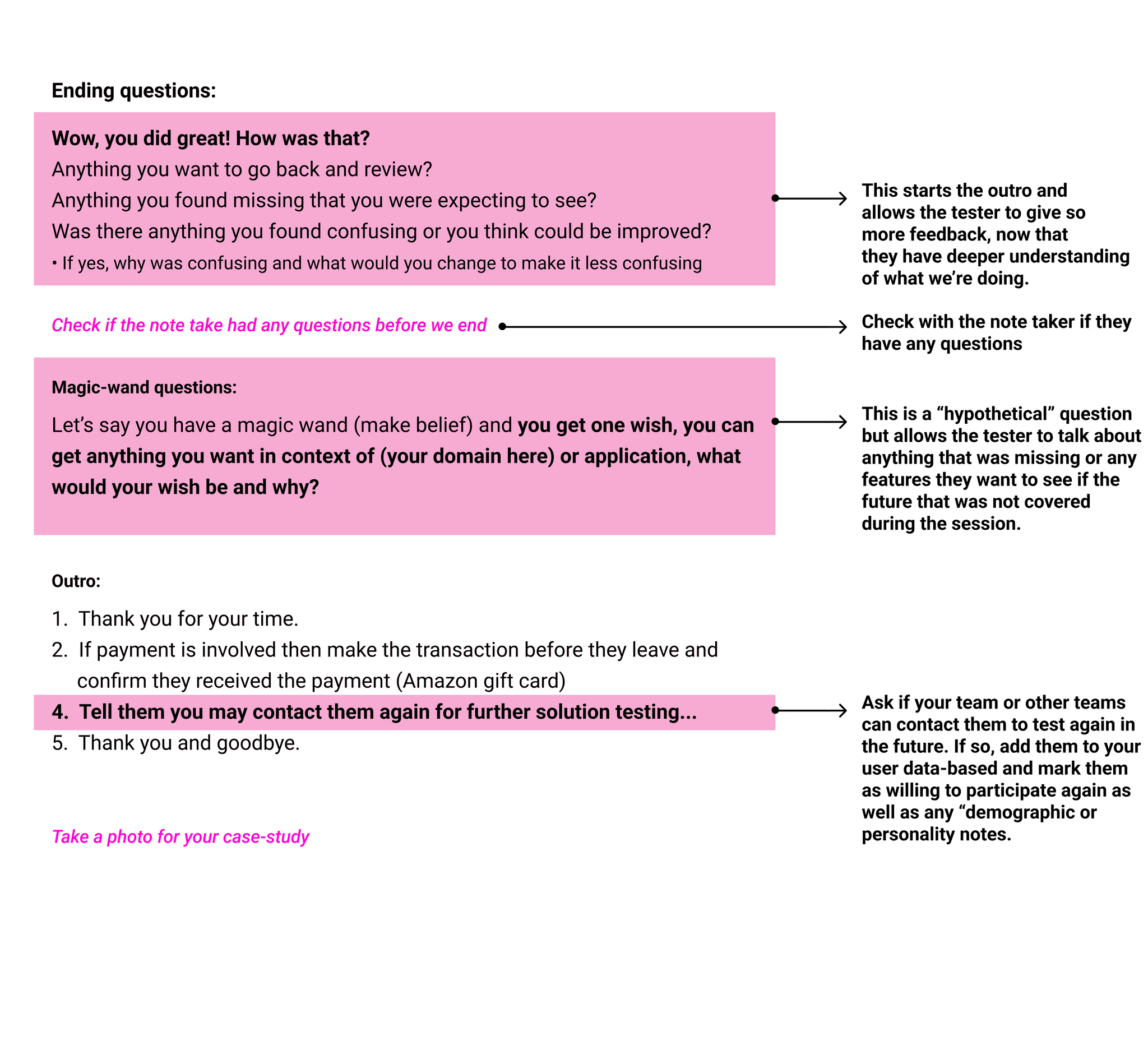
Place the tasks & questions into the user testing script. Make sure the script follows the order of the tasks within your application or prototype. Follow this template: fill out the introduction section, add the tasks + questions, & the outro section:
INTRODUCTION SECTION
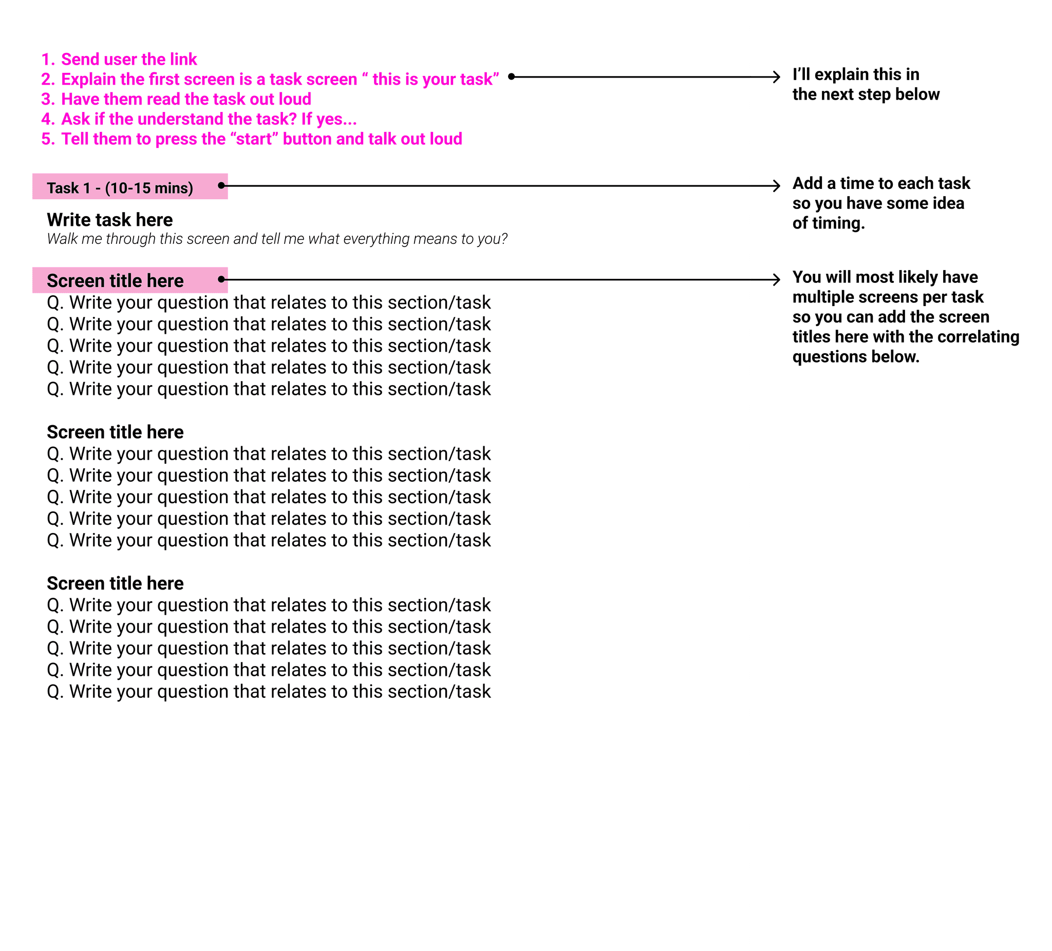
QUESTIONS SECTION
Use as many of these pages as you need to fit your tasks & questions:
OUTRO PAGE
Download User Testing Script
4
TASK SCREENS
You can do this as the first thing you do as well.
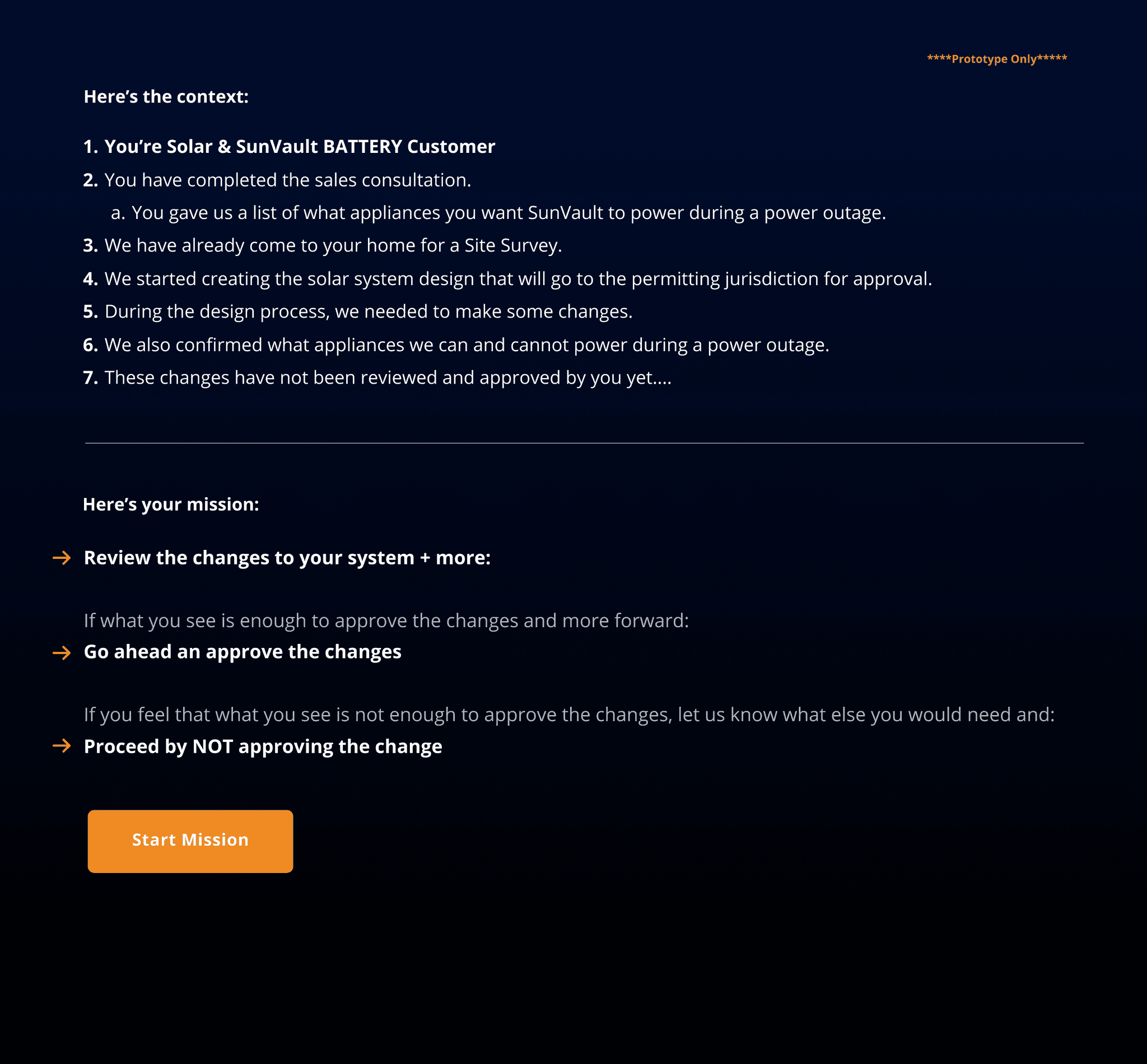
Make a copy of your prototype and name the new layer/file "testing prototype" and create "task screens" for each task. These will be the first screen that the tester sees before starting the task, it includes the following:
• A label that says "prototype only"
• Make it visually different from the application (ie: dark ui) so the tester doesn't think it's part of the app
• Any context that helps situate the circumstances
• The task or you can make it "your mission" to make things more fun
• A button that says "start task" or "start mission"
After they click/tap the button—it will take them to the first screen on the prototype/application
EXAMPLE
Have them read this out loud, make sure they understand the context, and the task. Let them ask any questions if needed and have them hit the start button when ready:
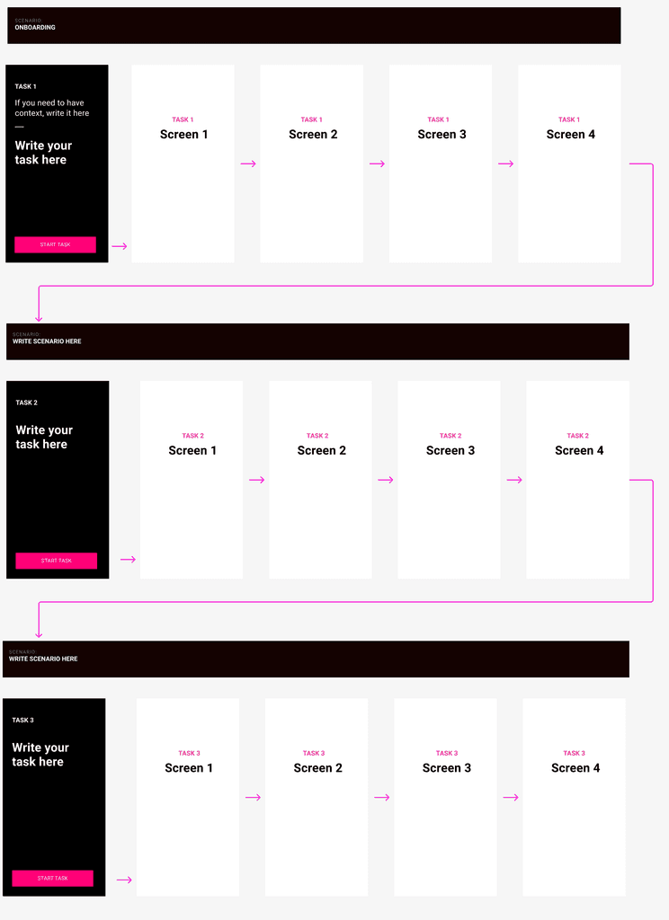
Set up the testing prototype to look something this below:
• Each task-screen will kick off the prototype specific to that task
• You may also create "secret buttons" that end one task and take the user to the next task
If testing a live application
• You can have the link within a Figma prototype type that just has tasks screens—the buttons go to specific url's within the live application
• You can also simply turn these task pages into pdfs (send link manually)
• If testing a mobile application (with no link) you can simply show the user tasks printouts or pdf doc
with no button links and just talk through each task before going into the application
More about recording
tools & testing guide
General user testing tips