VISUAL DESIGN
What is good & successful visual design?
Good is subjective / Successful is objective.
Real-estate for content
Visual design is crafting aesthetically pleasing visual information that conveys a specific tone/emotion in a way that is easy to interpret & understand resulting in a consistent long-lasting brand relationship with products & experiences.
Visual intentions can inform people's reactions, set expectations, and guide people's actions.
Visual Storytelling: Communicating a narrative through design elements
Aesthetic Sense: Having a taste for what looks visually appealing & can meet emotion/tone objectives
Conceptual Thinking: Ability to translate complex problems/information into simple ideas
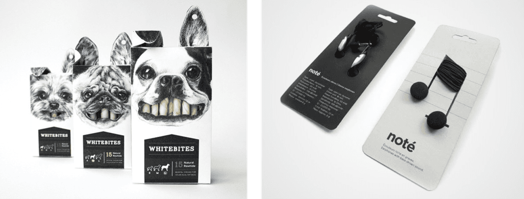
THE VISUAL DESIGN CRAFT
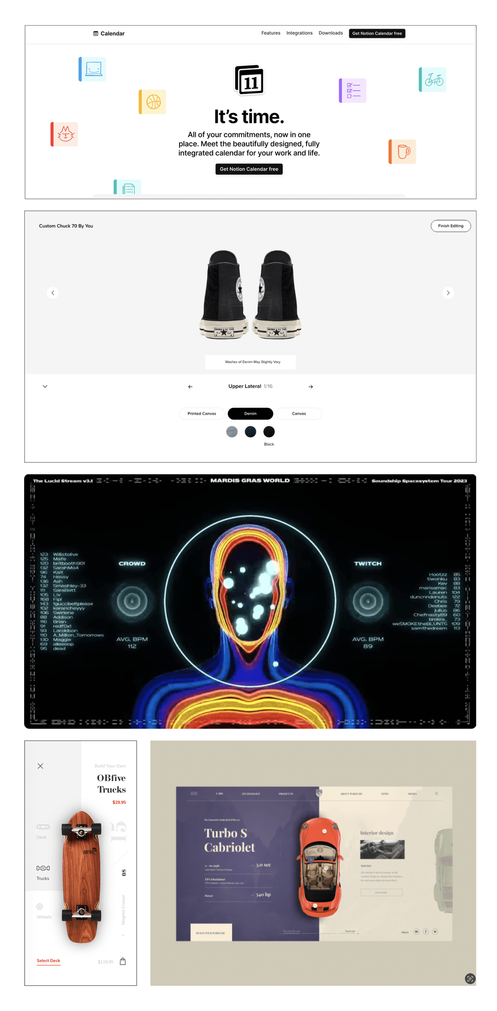
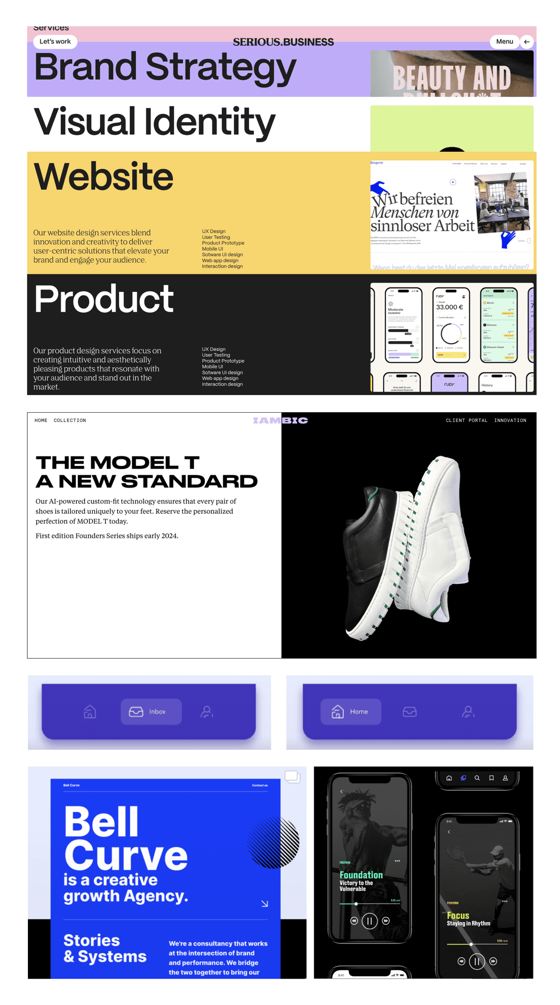
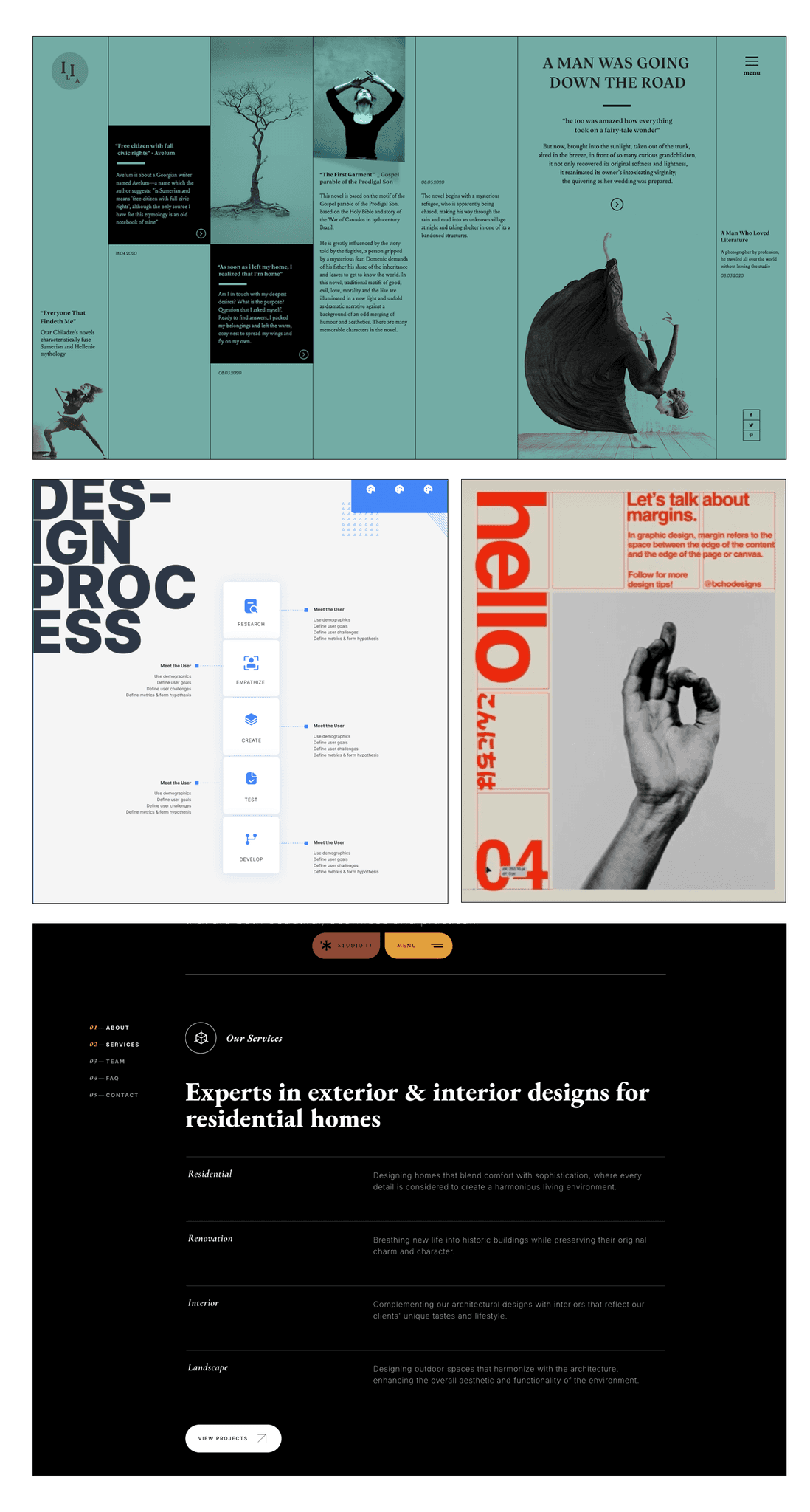
• Layouts, grid compositions, hierarchy & negative space
• Typography
• Color theory, contrast, & textures
• Illustration, iconography, images & shapes
• Design systems, design patterns & device paradigms
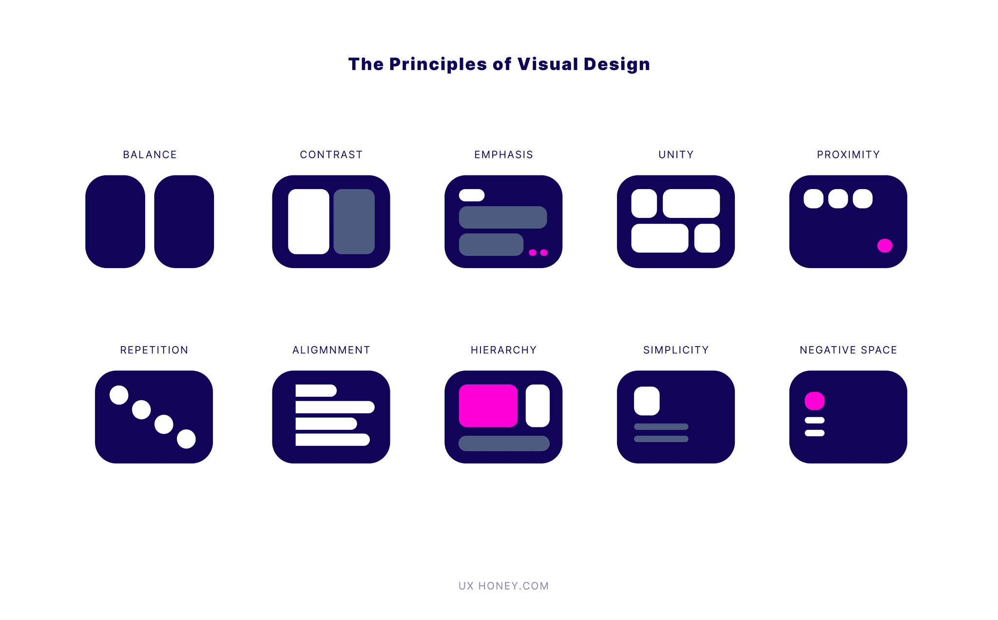
10 Principles of Visual Design
When creating visual layouts/design, designers tend to use these patterns, in most cases, it's not a conscious decision but rather a combination of taste, purpose, and consistency that causes us to engage with these principles. Use the principles as your visual language to help further discuss why a particular design or section is working or not working.
Balance
Visual “weight” in a design. There are two types of balance, symmetrical, and asymmetrical. Symmetrical balance is achieved when elements on either side of a central axis are identical or nearly identical. Asymmetrical balance, on the other hand, relies on different elements that have equal visual weight to create balance.
Contrast
Making elements stand out by highlighting the differences between them. Contrast can be achieved through differences in color, size, shape, texture, and other visual properties.
Emphasis
The focal point, emphasis is about giving certain elements in a design more prominence. Emphasis helps guide the viewer's eye and can be used strategically to convey the most important message or information. This can be achieved through contrast, size, color, or placement.
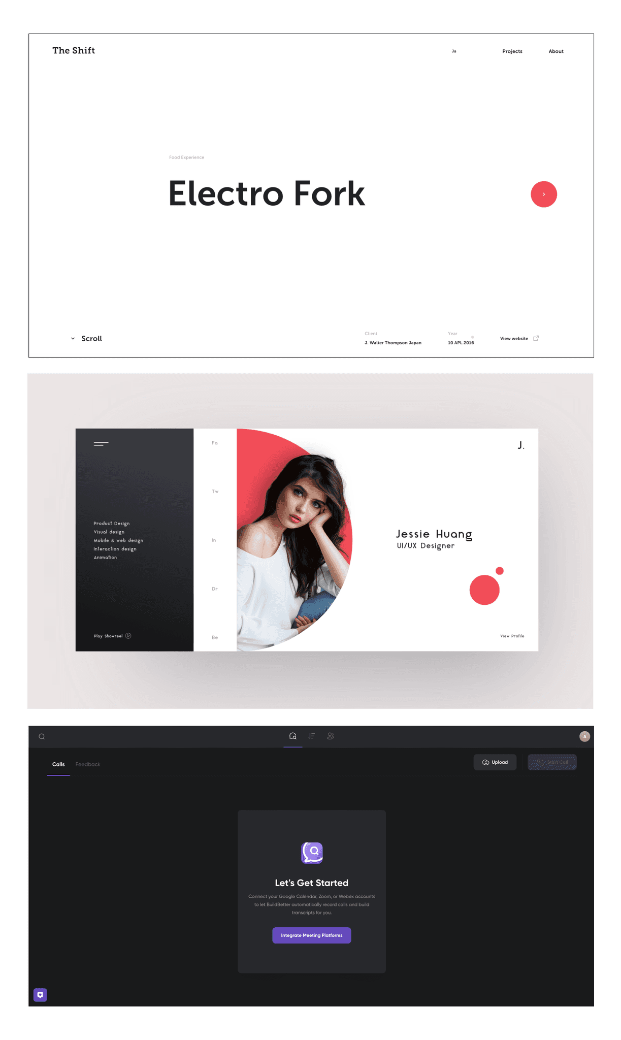
Unity
Cohesion and consistency of a design. It's ensuring that all elements in a design work together harmoniously to create a sense of oneness.
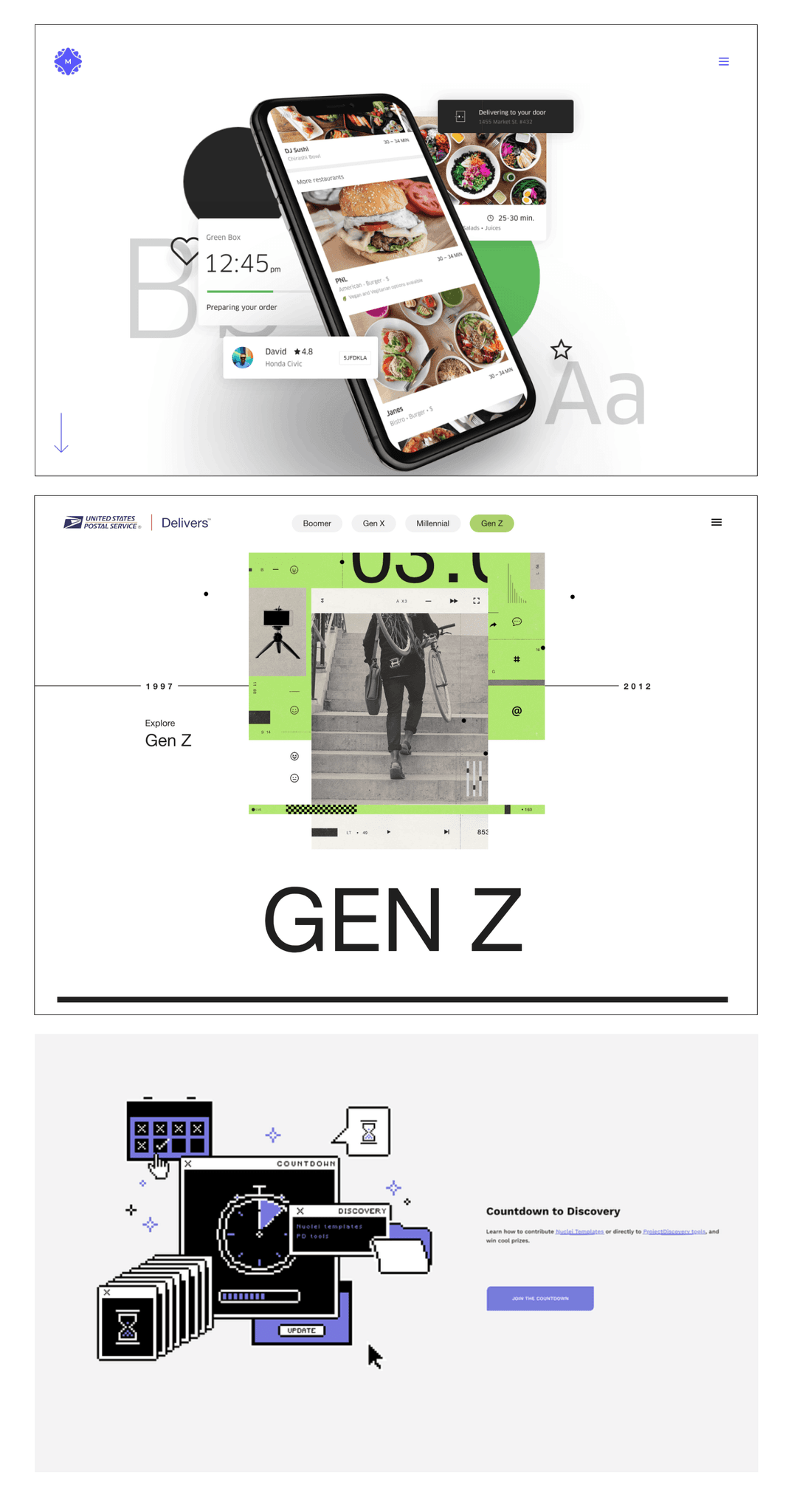
Proximity
The arrangement of elements. Objects that are next to each other are perceived as related, while those that are further apart are perceived as separate. By grouping related content together, designers can create a clear and organized layout presented in a logical and readable manner. This can be one with a clear understanding of information hierarchy with a simple parent, child, and grandchild relationship order and can get much more complex with looking at software tools.
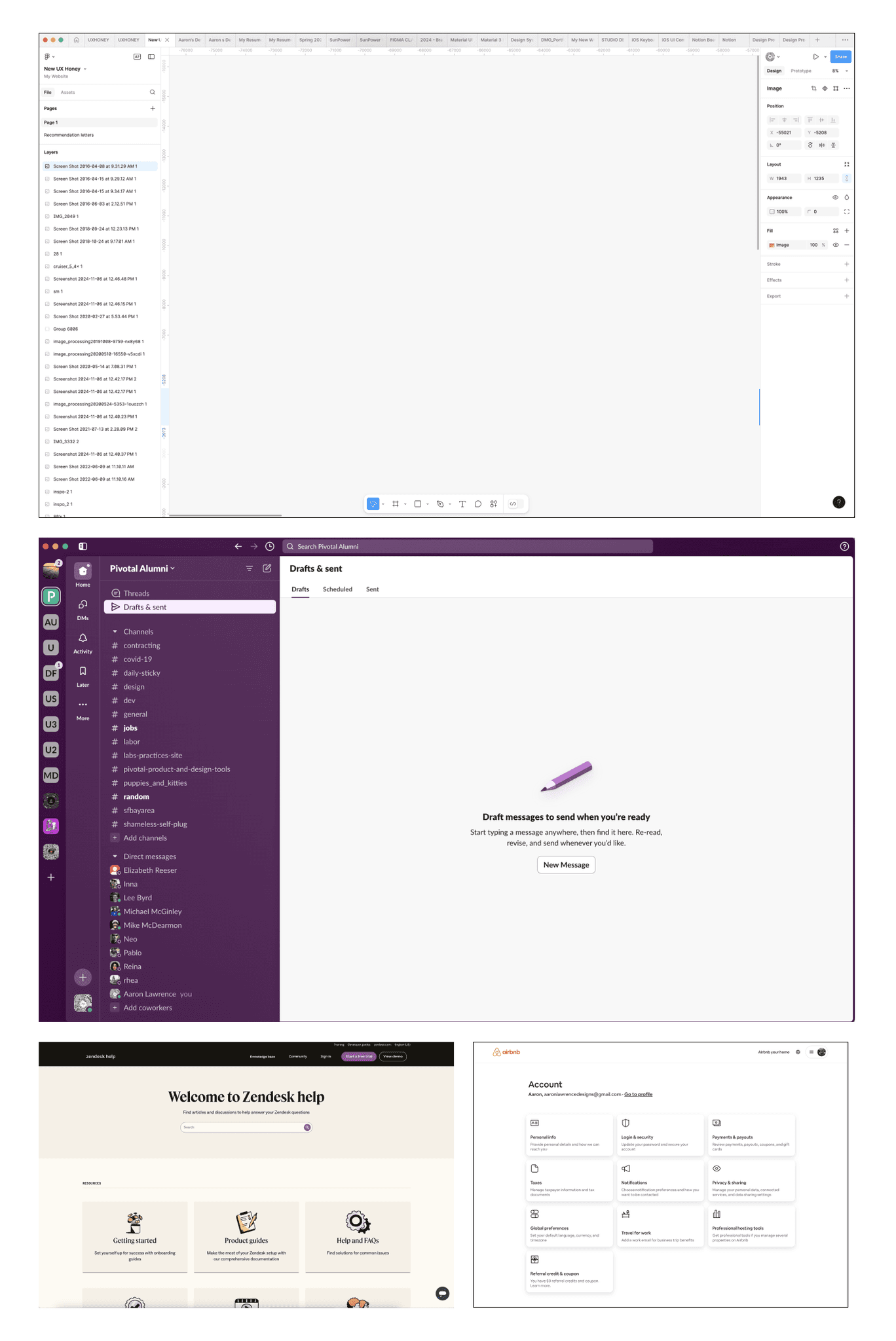
Repetition
Same or similar design elements throughout a design or content to create a sense of consistency and cohesiveness.
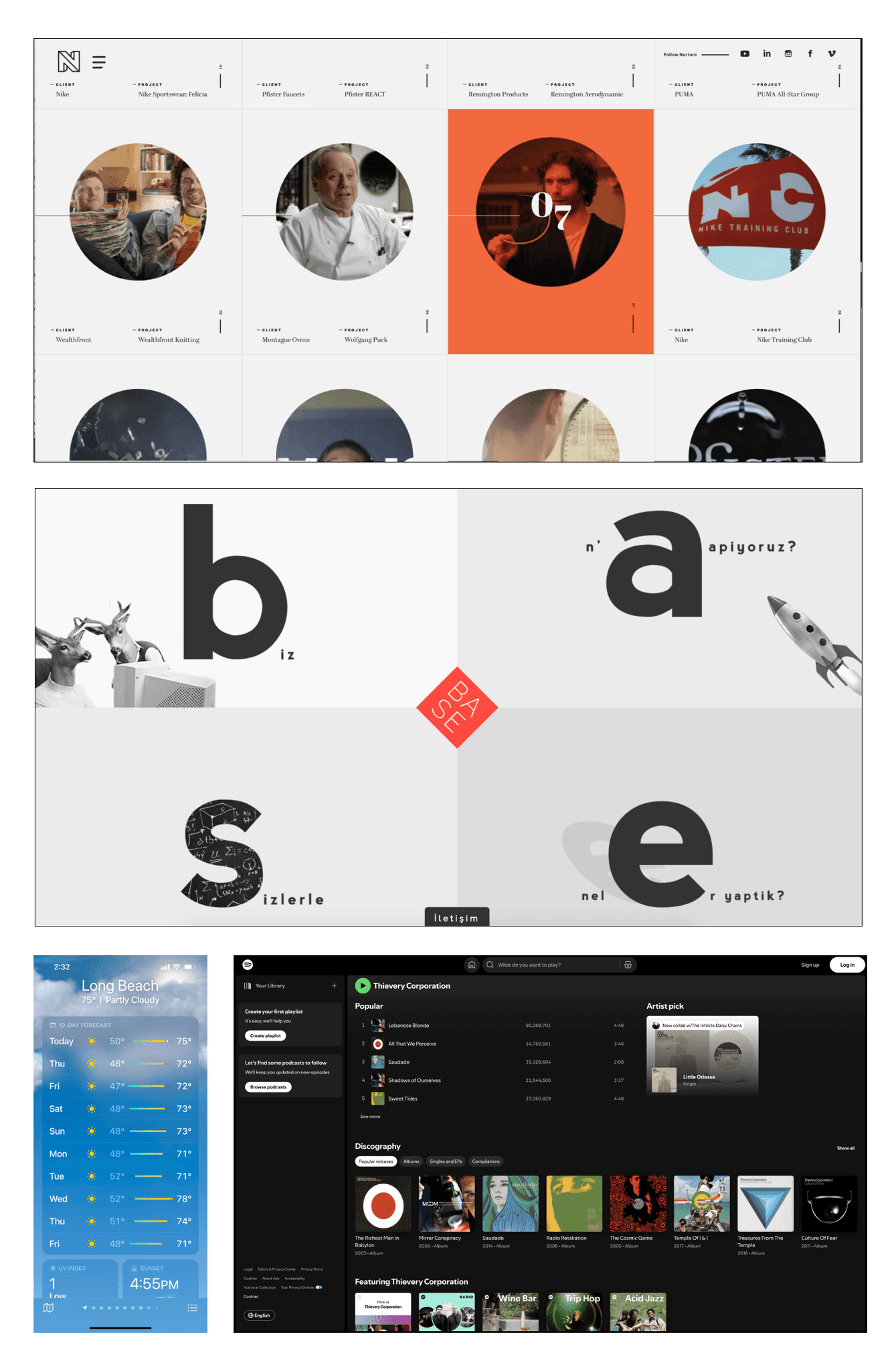
Alignment
Ensuring that all elements in a design are visually connected, positioned purposefully, and/or connected to a grid. Proper alignment creates a clean, properly spaced, and organized look that makes a design more visually appealing. Misalignment can lead to confusion, misinterpreted UI bugs/errors, and/or lack of visual order.
Hierarchy
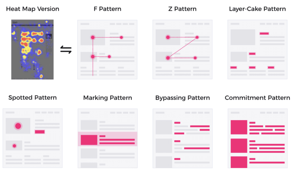
Organization of content to convey the visual priority and importance of different elements. This helps guide the viewer's eye through the design, helping them understand what to focus on first, second, and so on. Elements that are more important should be more prominent, while less important elements should be subordinate. You can use the squint test to easily distill content as abstract "shapes/blocks" to see the hierarchical order. You can also see here how people scan information in very common directions that you can use to unsure you content follows
Simplicity
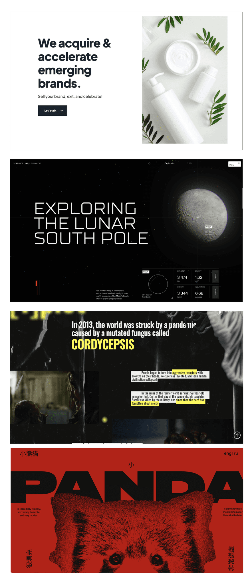
Eliminate unnecessary elements, use good negative space, and reduce content to what's needed. Simplicity in design makes it easier for the viewer to understand the message and creates a cleaner, more elegant look. K.I.S. theory - keep it simple as less is more. Simple doesn't mean easy.
Negative Space
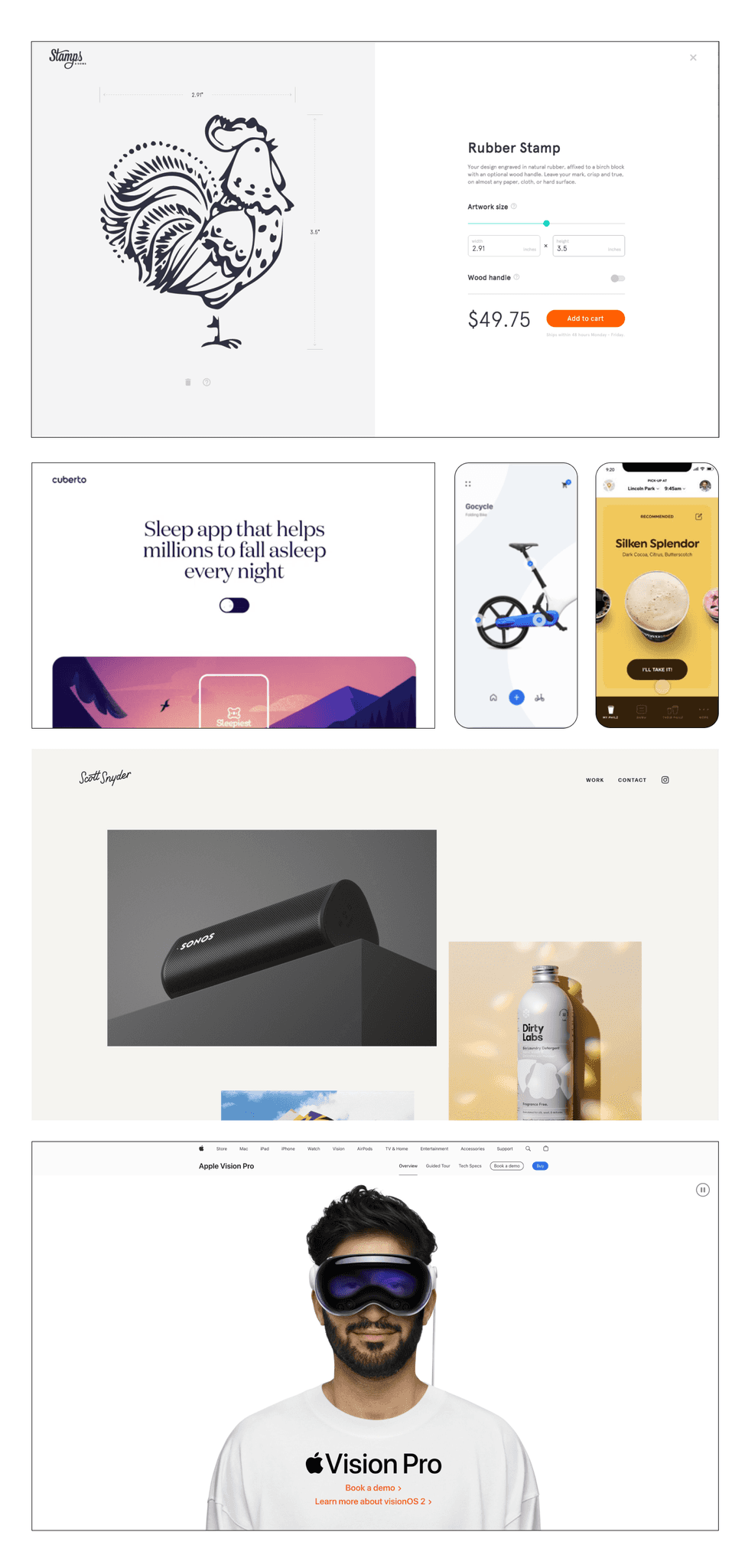
The empty space. Negative space is just as important as actual design elements, although it's empty, it's just as important when balancing a composition and visual appeal. Using negative space can help highlight important elements, create breathing room, and improve the clarity of a design.
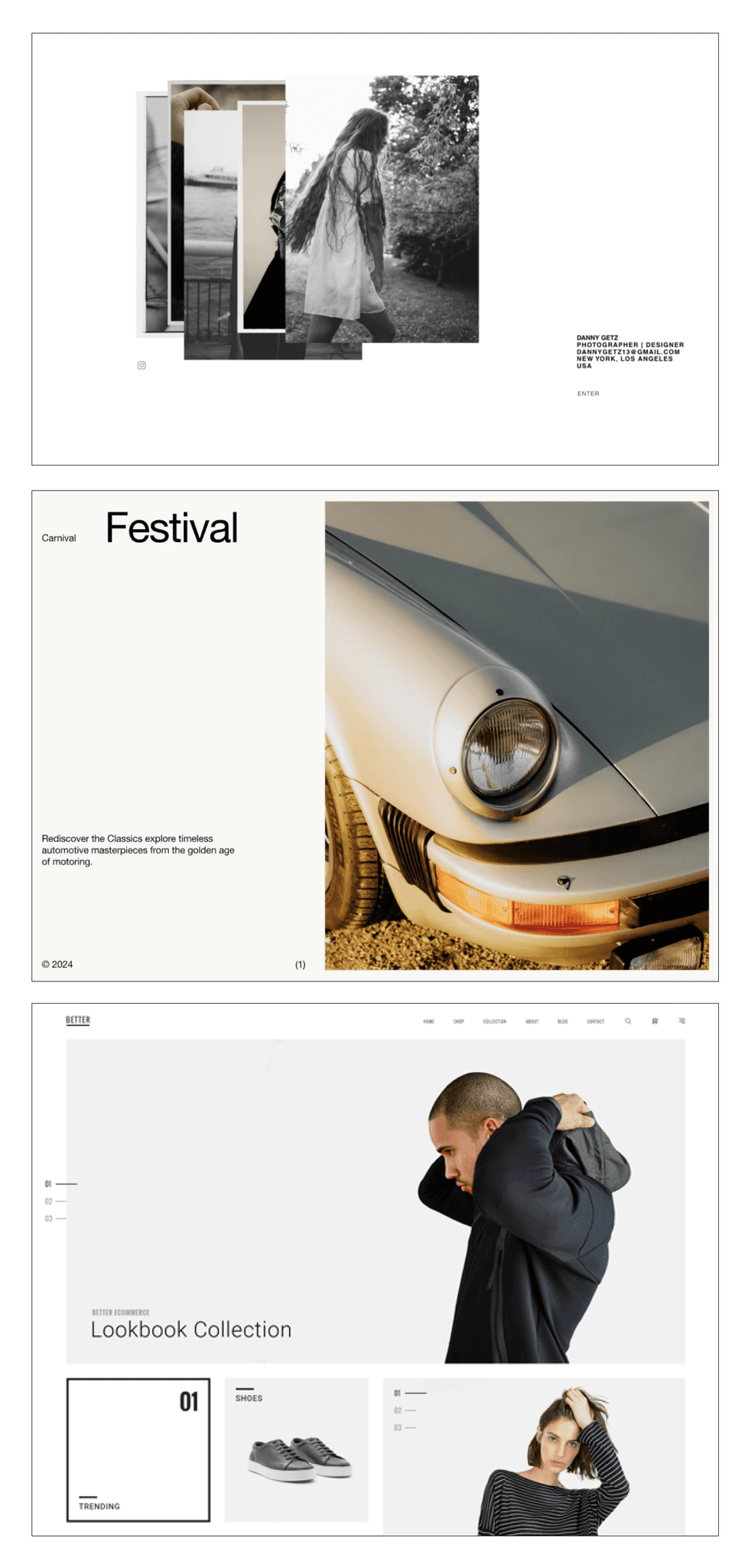
TIPS ON IMPROVING YOUR VISUAL DESIGN
• Practice typography setting & layouts
• Practice, practice practice, get inspired by something then make it your own
• Create 1-2 screen app designs for fun ie: electric skateboard app, electric car app, health portal
• Use different grid types when starting with a composition or layout
• Create a inspiration repository of screenshots of designs you like
• Use mood boards to help fine tune what type of mood you're looking to achieve
• Describe your mood with adjectives then apply mood board examples to each adjective
• Use accessibility to give constraints in your design decision making
• Use color generating website for color palettes (see below for links)
• Use visual communication over contextual communication = not everyone reads - people scan information first, then make a decision on what to read
• Download/use lots of apps, decipher their hidden UX, appreciate good design
• Use existing design systems = gives good constraints
• Follow existing design patterns and device ui paradigms
• Avoid using too many colors or gradients — keep it simple
INSPIRATION SITES
Go get inspired
awwwards.com
dribbble.com
behance.net
curated.design
refero.design
tympanus.net
scrnshts.club
httpster.net
saaspo.com
uxarchive.com
darkmodedesign.com
minimal.gallery
onepagelove.com
brandingwebsite.com
designvault.io
siteinspire.com
ui8.net
flowjam.co/
cofolios.com
60fps.design
mobbin.com
curated.design
a-fresh.website
COLOR GENERATION
Color palette creation tools
Coolors.co
Colormagic.app
Colormind.io
Pigment.shapefactory
color.adobe.co
Colors.muz.li
ICONS SITES
Find free icons to use
thenounproject.com
hugeicons.com
fonts.google.com
lucide.dev/icons
feathericons.com
fontawesome.com
Iconlypro - plugin
flaticon.com
UX DESIGN RESOURCES
Principles, laws of UX & more
lawsofux.com
humanebydesign.com
uxplanet.org
nngroup.com/articles
patttterns.net
Gestalt principles
DESIGN SYSTEMS
Design system resources
System checklist
magicui.design
radix-ui.com/primitives
m3.material.io
Apple interface guide
Atomic Design
PHOTOS & MORE
Photos, 3D icons & illustrations
unsplash.com
istock.com
envato.com
sapiens.ui8.net
stock.adobe.com
undraw.co
blush.design
opendoodles.com
pixabay.com
freepik.com
pexels.com
shapefest.com
iconscout.com
icons8.com
ANIMATIONS & LOADING
Animation & loaders recourses