TYPOGRAPHY
Guidelines & rules for typography
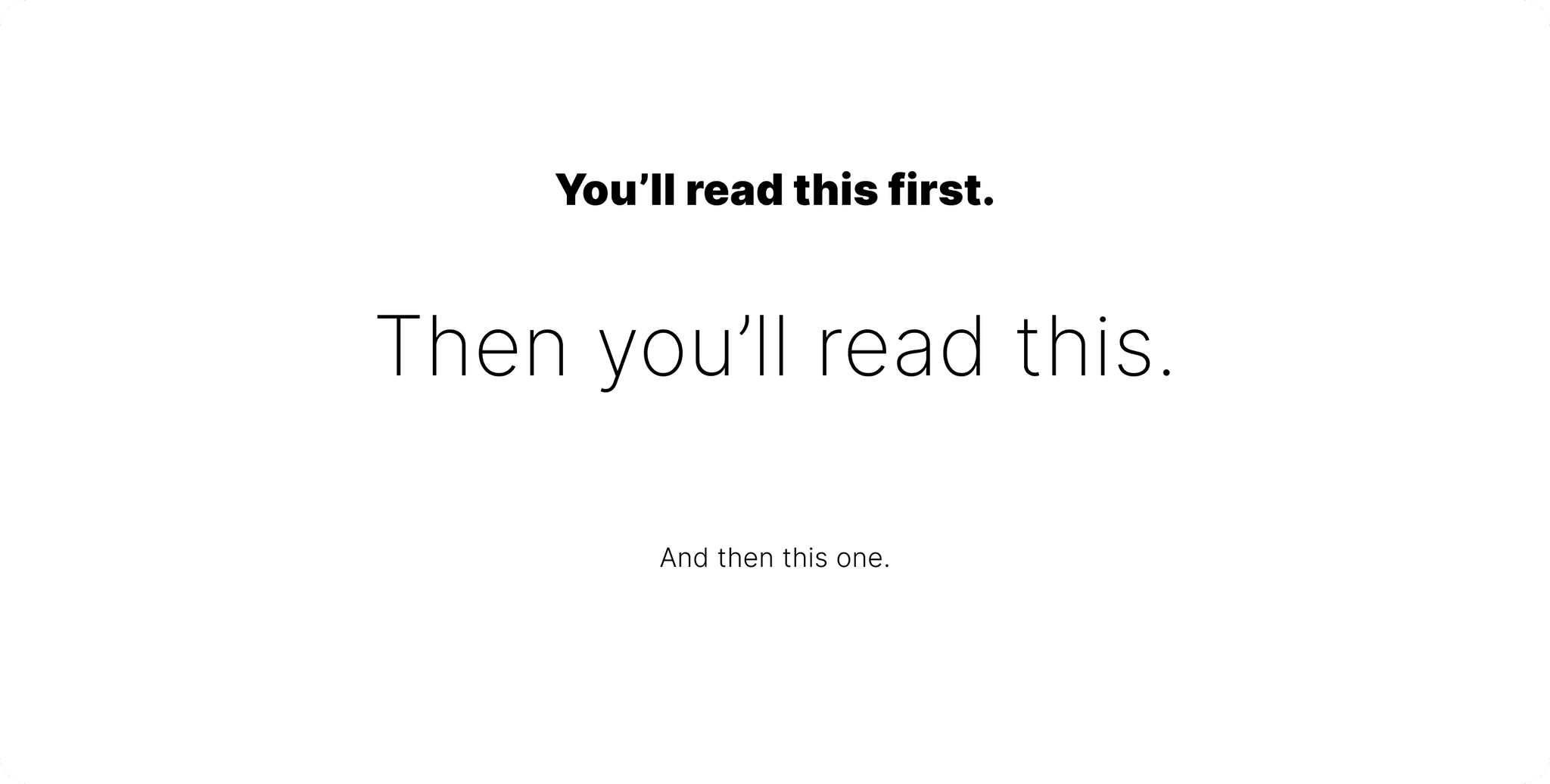
Manipulate these variables to control visual hierarchy (become a master at this)
• Order
• Visual weight
• Color
• Design elements
• Spacing
Use order:

Use visual weight:

Use color:

Use design elements:

Use spacing:

Text needs to have good accessibility.
Ensure text is readable for all users, including those with visual impairments.
Check the following to ensure good readability
• Font Size: large enough for different devices
• Line Spacing: adequate spacing improves readability
• Contrast: high contrast between text and background

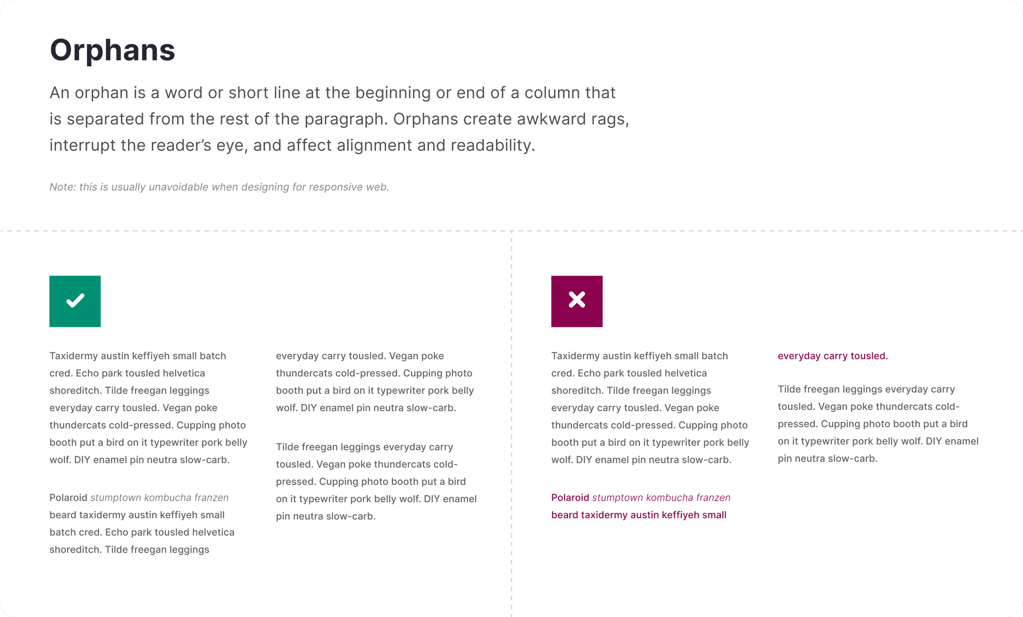
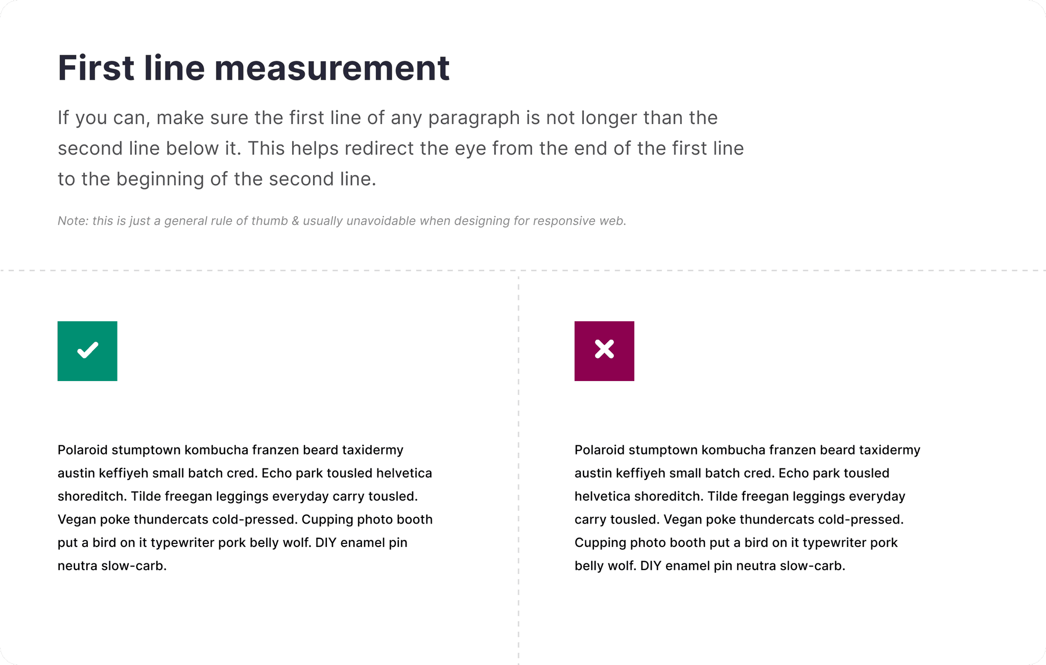
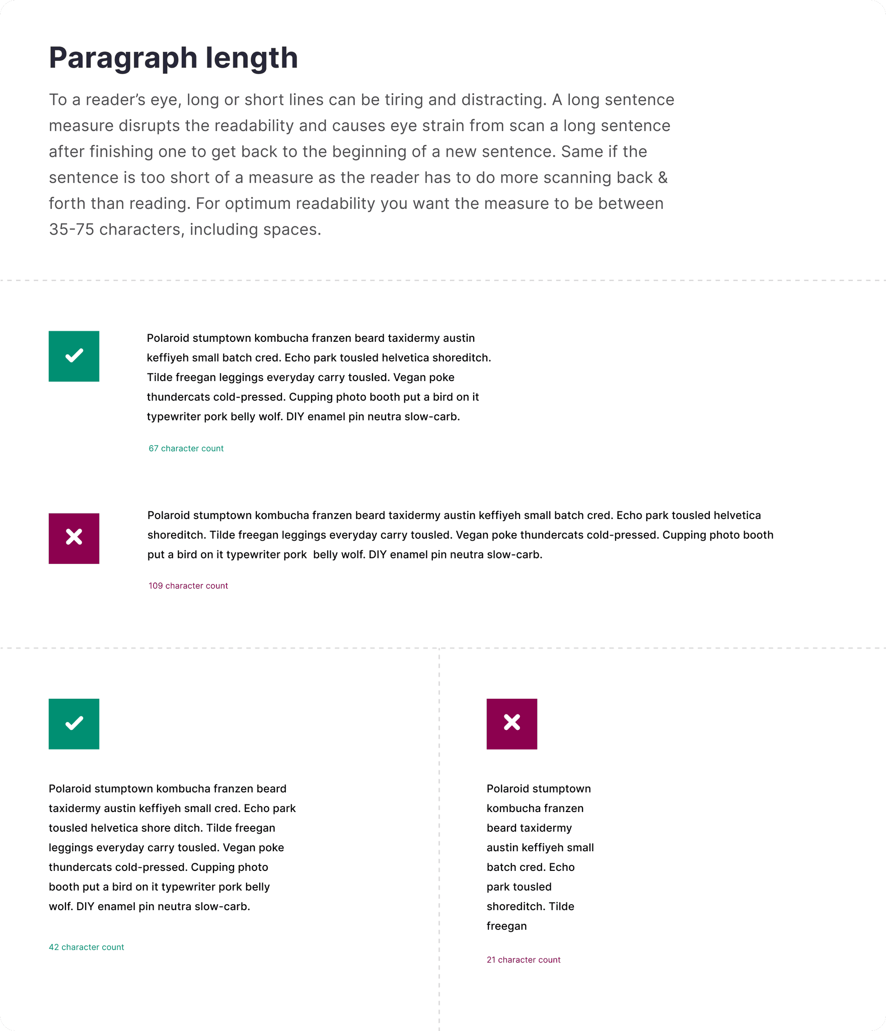
General paragraph rules
Follow these general guides for good readability & scannability


