PAIRING FONTS
Opposites attract
Guidelines for pairing fonts:
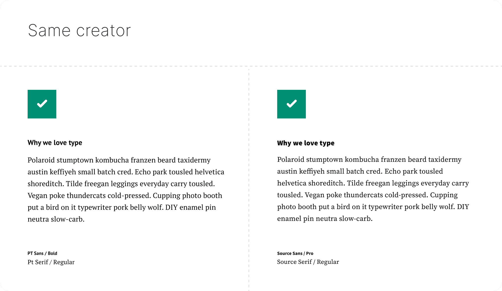
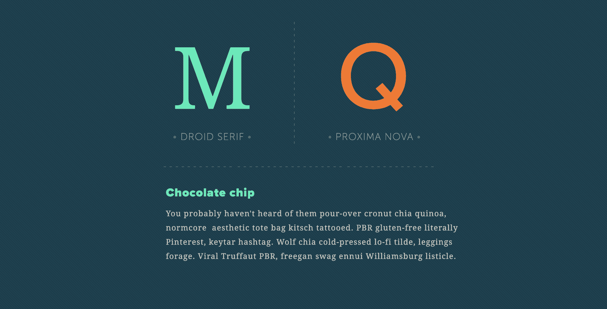
Pair a Serif with a San Serif or vice versa
Generally avoid pairing two Serifs or two San Serifs—as they are two similar
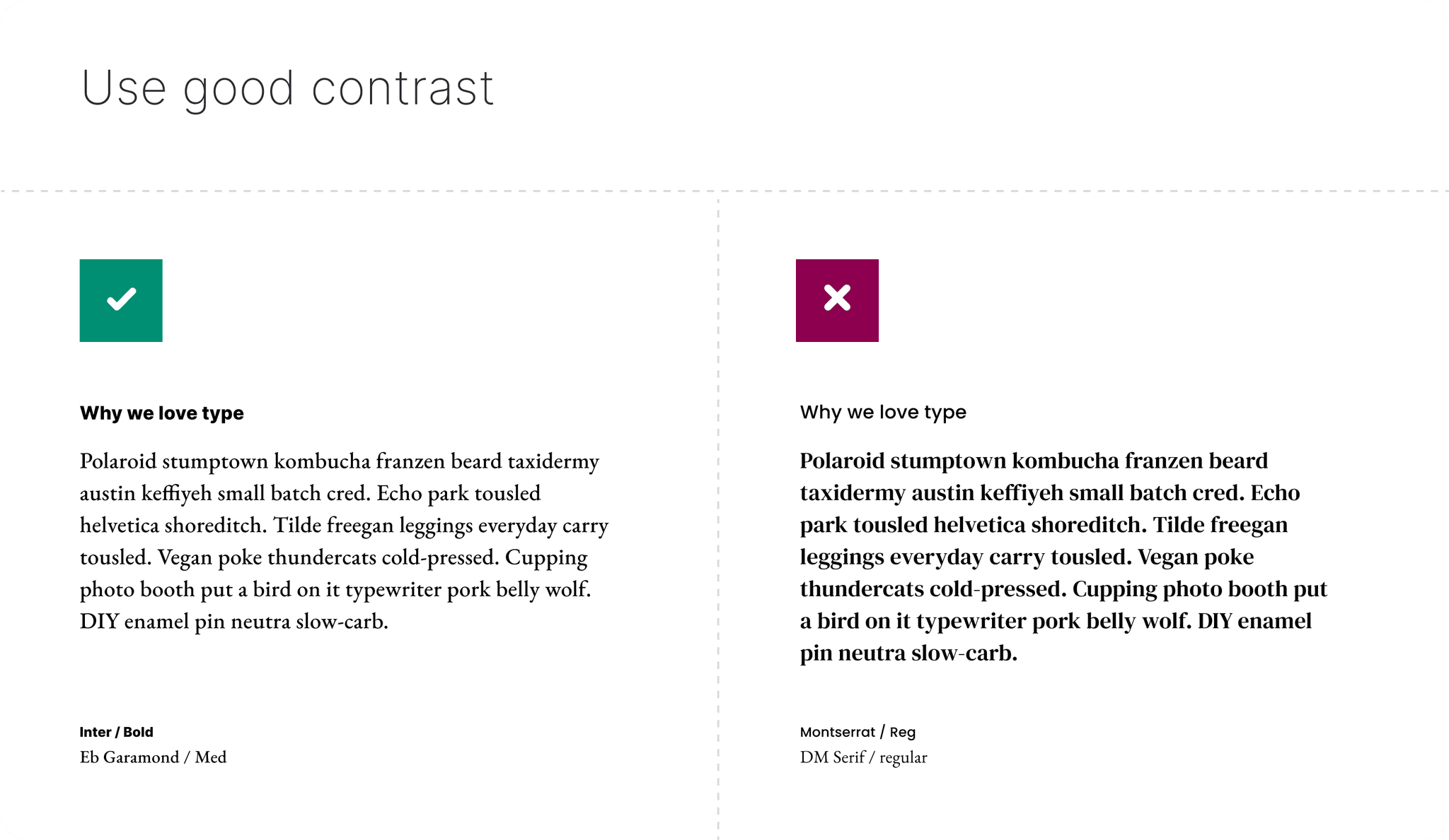
You only need two fonts, avoid having too many font types
Pay attention to priority — which font is going to be used for headlines vs body text
Keep body text fonts that are best used for readability
Unify the different fonts using the same color or contrast if needed
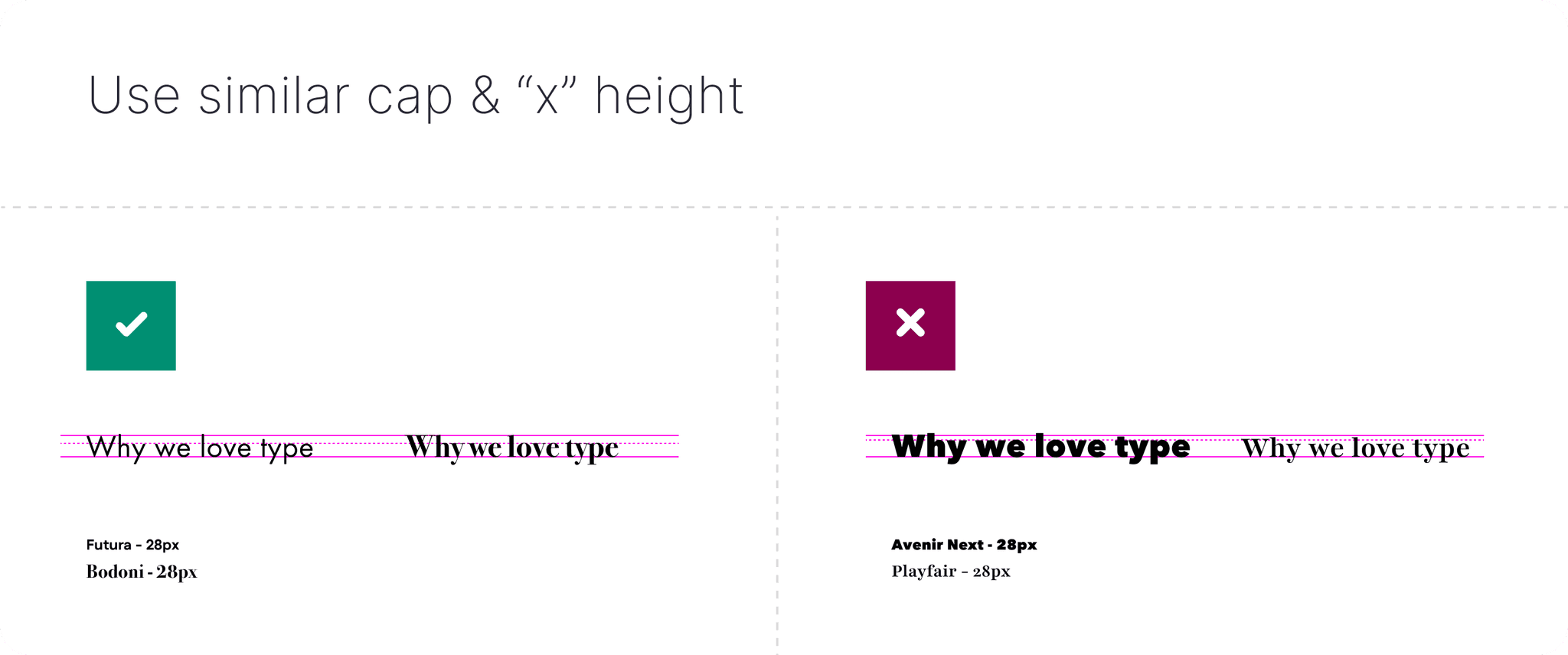
Avoid anything too similar & make sure each font has enough families (light, bold, etc) to allow for good hierarchy between each font type—unless you're planning on using a "themed font" for strong personality to use for large headlines.
See below:

PAIRING EXMAPLES
Pairings that work well together
It's about the small nuances that each type face has to offer.
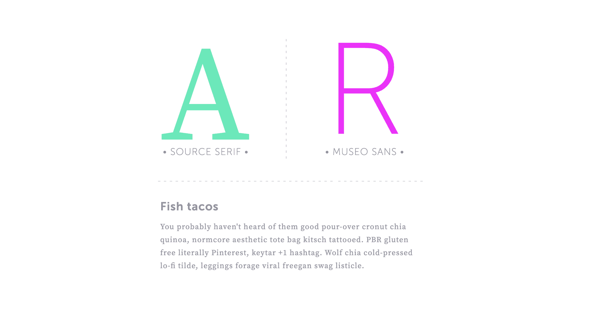

Josefin Sans / Playfair
Open Sans / Baskerville
Ubuntu / Lora
Montserrat / Baskerville
Helvetica or Inter / EB Garamond
Source Sans / Times New Roman
Sofia Sans / Crimson Pro
Noto Sans / Noto Serif
Find more pairing here