SYSTEMS
The design system
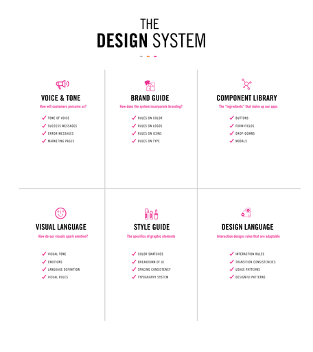
A set of design rules, components, and styles that can be adopted by other products within an organization or other companies within the industries. The system is not static; it contains live components that engineers can reuse while the same system lives in Figma for designers to reuse, keeping a unified, efficient & consistent approach to application design.
People Involved
Creators - these are designers, brand team, & engineers.
Users - these are the teams & individuals that will use our system to build products & create content.
Observers - stakeholders, product managers, executives—they care about value of us spending time creating a design system and what impact (implicit & explicit) that will have on important company metrics.
Supporters - advocate for the design system, they can give feedback and help use scale systems.
Ask what the intended purpose(s) are for a specific component you're making, as this will connect your component to use cases and functions. Example: accordions are used for "add-ons' within our product selection page and FAQs on the support page.
GRID SYSTEM
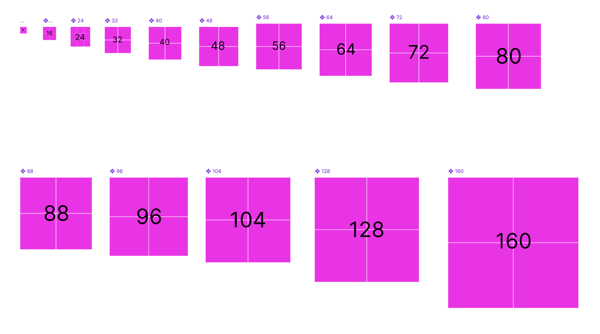
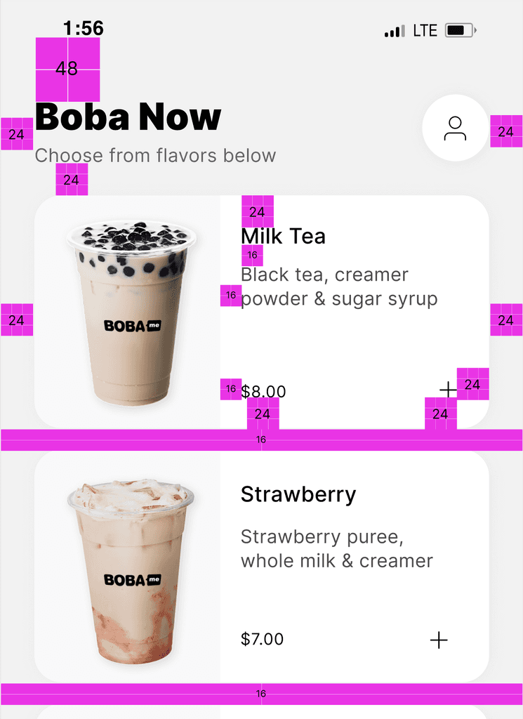
8pt grid system for spacing
The value of an 8pt grid is in standardizing the spaces between things. Most commonly, this means choosing the right values for margins and padding. Create spacing assets that follow the increments of 8.
Note: If you get larger in spacing sizes you may not need as many smaller increments ie: 160px, 200px, 280px, 320px
TYPE SYSTEM
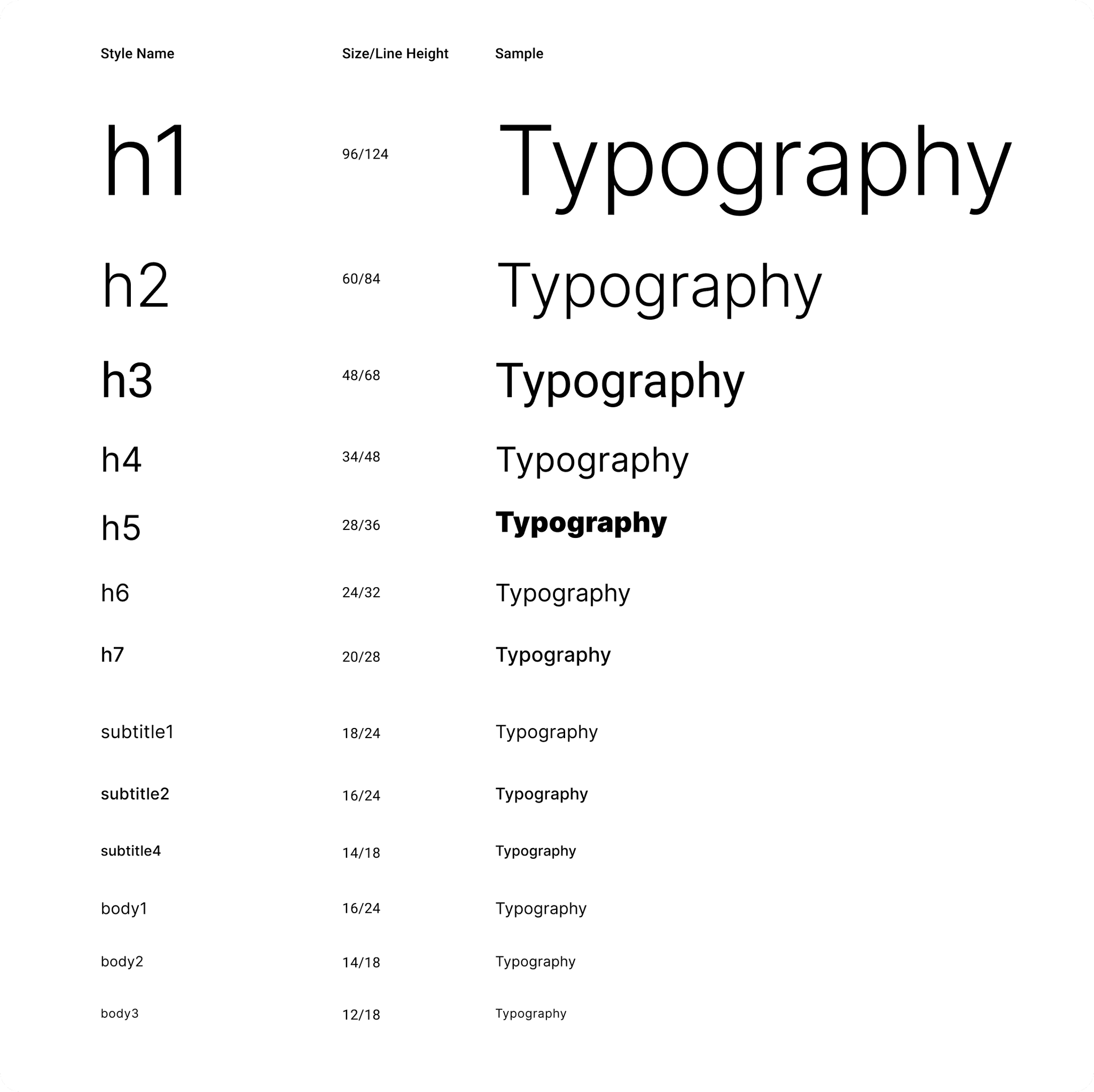
4pt type system
There is no hard rule on what sizes you must include in your type system (I follow Google's material design type sizes). The 4pt type system has to do with line height—every font size you have should contain a corresponding line height that aligns to an increment of 4.
Tip: the bigger the font size, the higher the line-height you'll need
BUTTONS
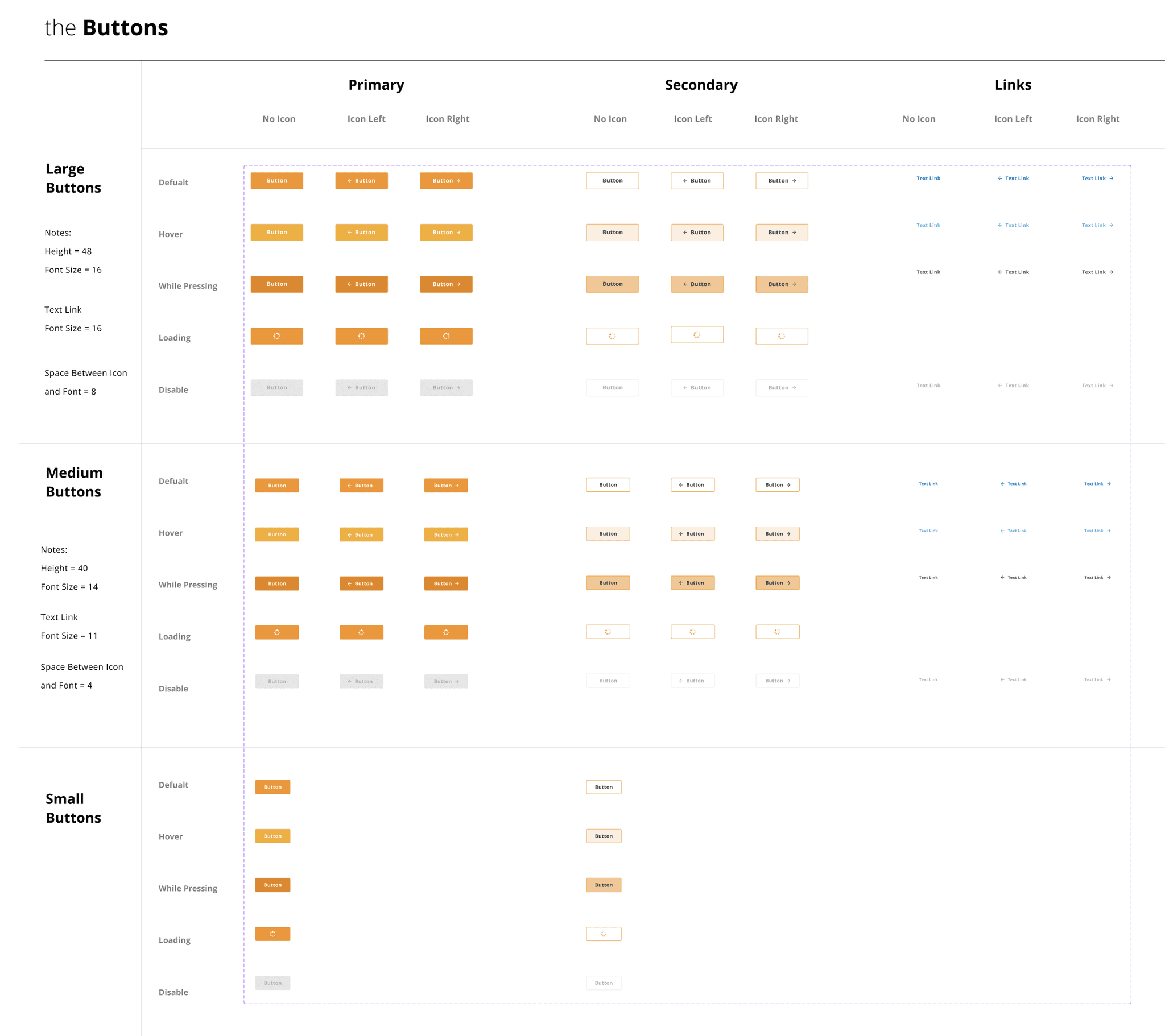
Buttons system
States & types:
• You may need different sizes small, medium, large
• Primary, secondary, tap/press, focused, hover, loading, success, & disabled states
• Icon only with no text, icon on left with text, icon on right with text
• Link only buttons
Tip: for improved accessibility use darker gray text for the disabled button (white doesn't have enough contrast)
FORM FIELDS
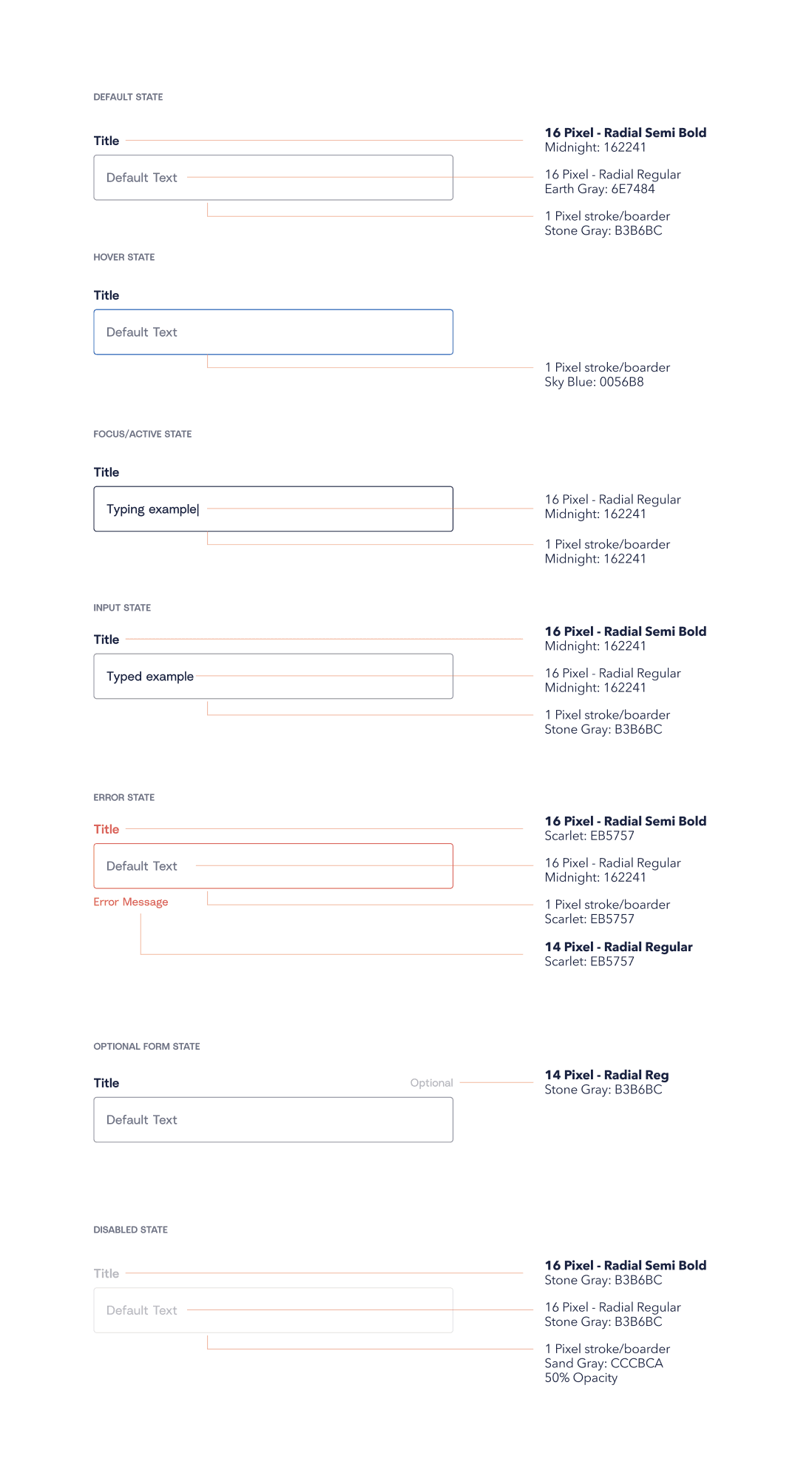
Form system
States & types:
• Form types like password, search + type ahead etc
• Default, hover, focused/active, input, error, and success states
• Required & optional types
• With icon on right and/or left
COLORS
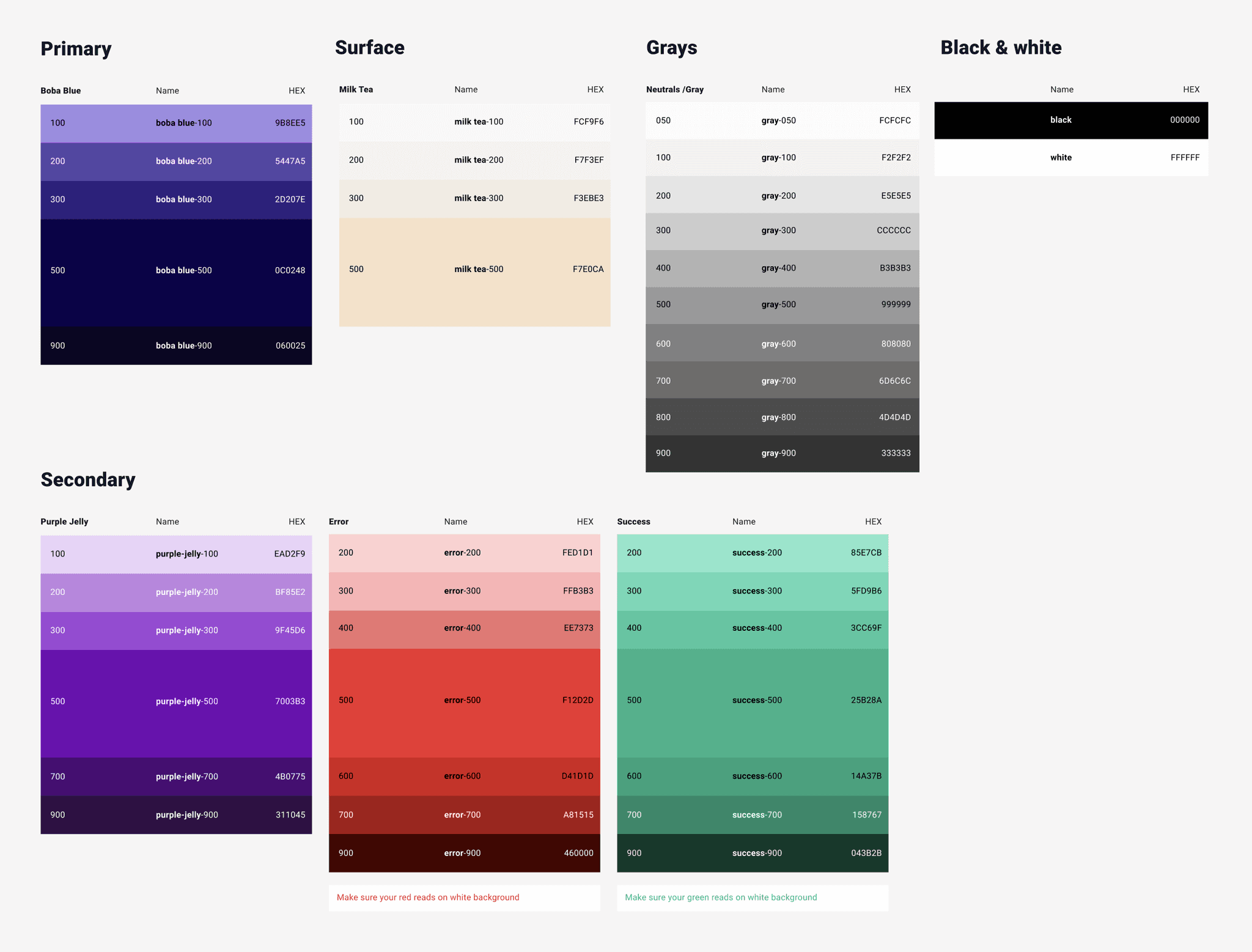
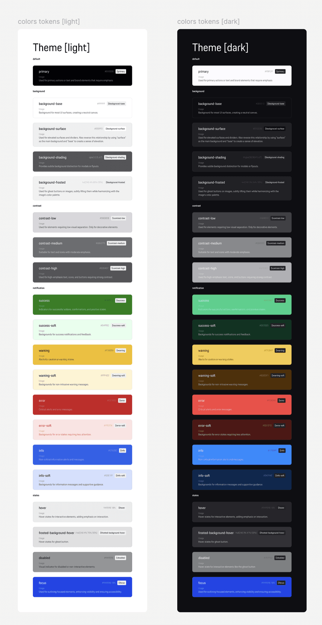
Color system
The basis of the system:
• Primary/accent color - primary actions & tones
• Secondary colors - secondary actions & tones
• Surface/Background - background colors
• Error, warning, and success
• Neutrals/Grays – text, boarders, shadows etc
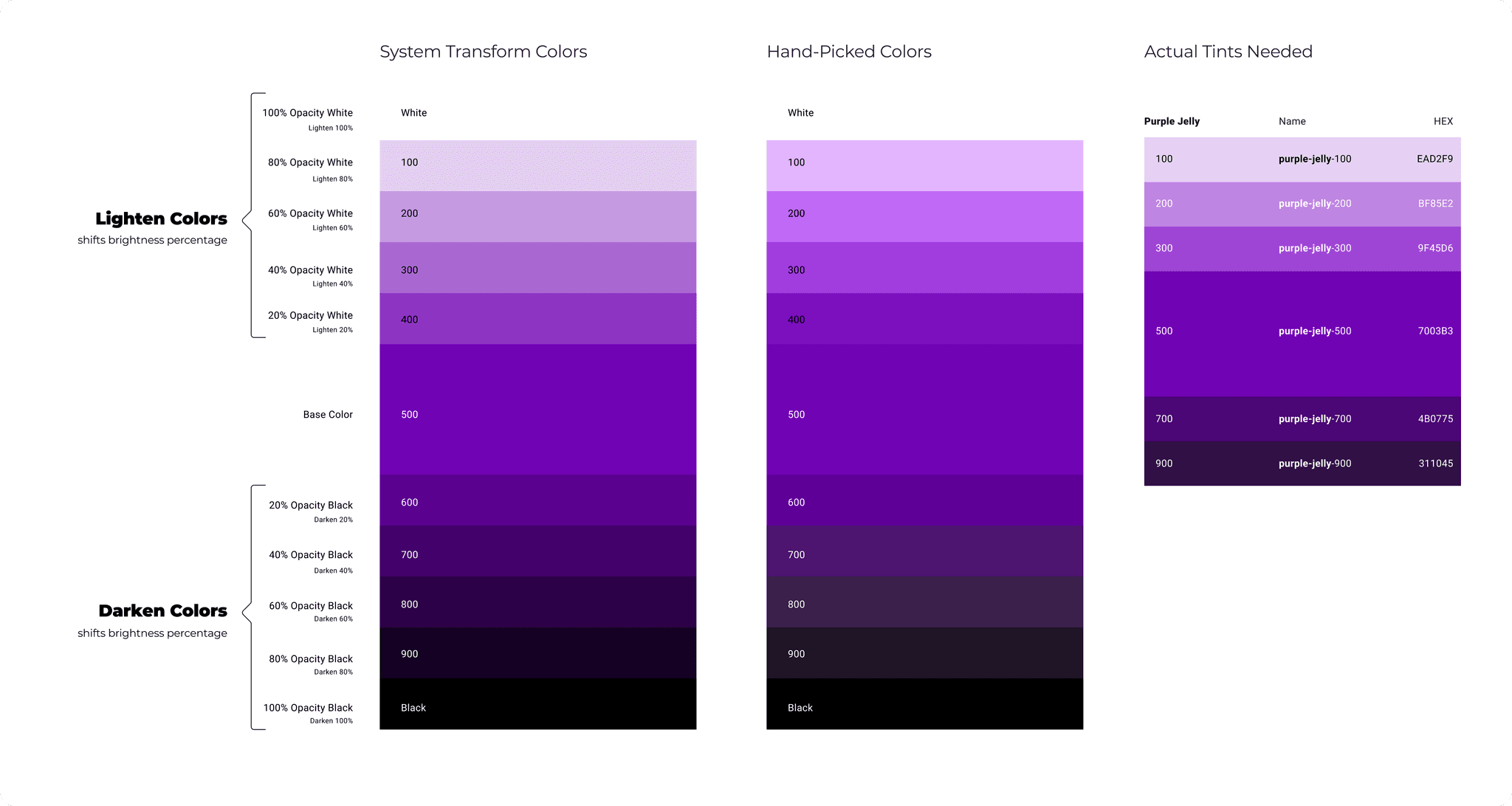
Transform vs hand picked color tints
Most systems are going to require a large or small set of tints for specific base colors. In most cases, we don't need every tint set for every color (we do for the grays)—2-3 lighter tints & 2-3 darker tints in most cases will be sufficient. When it comes to selecting tints, we may use transformation functions like lighten & darken percentages to select tints or "hand pick" them based on what works best for the system and accessibility. More often, I prefer to hand pick colors, as it allows for more control of tints.
Design System Check List
Download Material UI
(MUI) System Figma File
EXAMPLES
List of design systems
from top companies
All major companies
with figma file
Atlassian
Spotify
MailChimp
Apple
Porsche
Uber
Shopify
IBM
Catch all article