RESUME
Design resumes best practice
Regarding a good design resume:
The text fields have alignment and are not all over the place
The spacing is consistent between paragraphs and titles
The layout/typography looks custom and doesn't look like it was made in MS word
Black is not the only color being used (this can vary as I've scene nice one color resumes)
There is more than one size of font
There is no misspelling of words and it reads good
There is talk about user centered design, design thinking, research, usability testing & business results
There is talk about collaborations with other teams, product managers and clients
There's a link to a portfolio
Resume examples
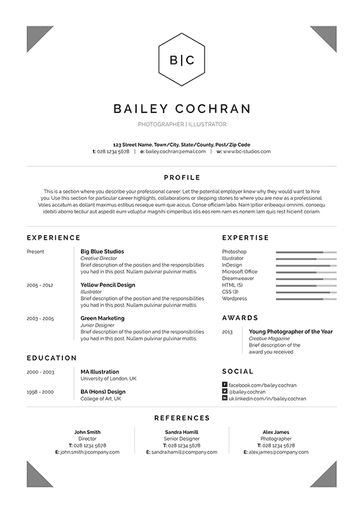
Why is this a good example?
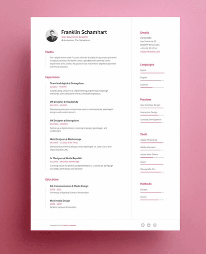
It looks custom and nice layout
It has consistent spacing
Has nice typography hierarchy
Spelling looks good
Has nice alignment
Uses more than 1 column grid
Has link to portfolio

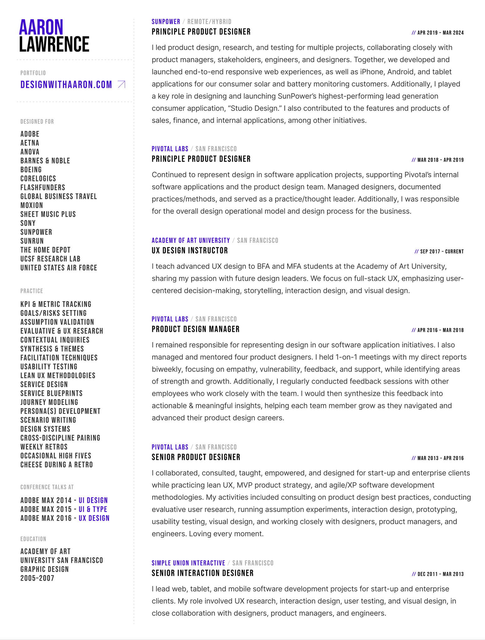
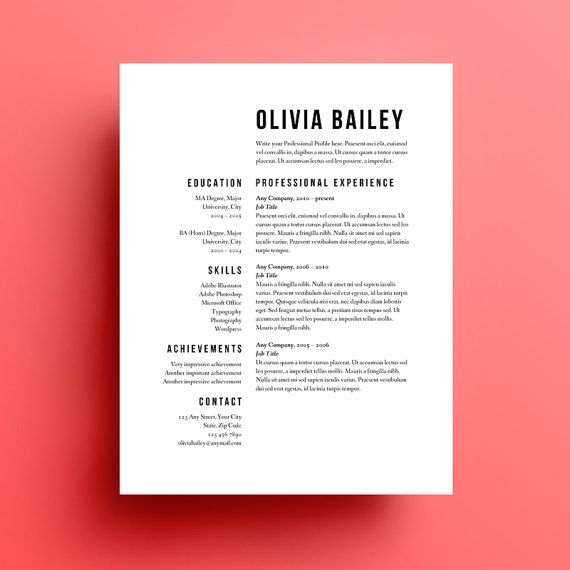
Why is this a good example?
Self branded
Nice, easy to read layout
Good use of type hierarchy
Has nice alignment
Clean spacing
Looks organize

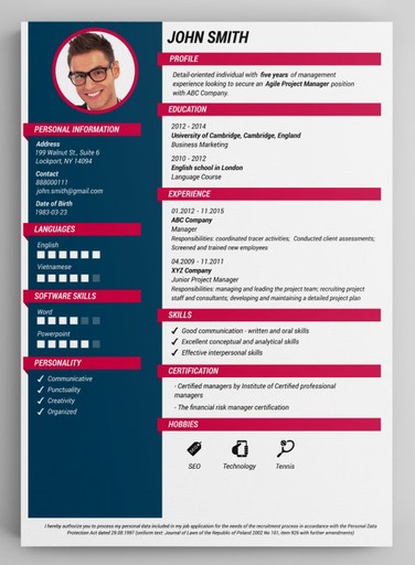
Why is this a not a good example?
Layout is not clean and easy to read
Spacing is not consistent
Sloppy typography hierarchy
Alignment could be better
Uses 1 column grid

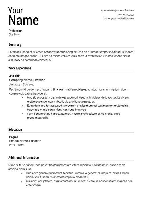
Why is this a not a good example?
Looks like it was made in MS word
Black is the only color
Type hierarchy is not that good
Spacing is inconsistent
Layout doesn't seem custom
Good Examples


Crappy Examples

