COLOR THEORY
Logical structure for color.
Color types
Primary colors: red, yellow and blue
Secondary colors - opposite of the primary colors: green, orange and purple
Tertiary colors – between primary & secondary colors: yellow-orange, red-orange, red-purple, blue-purple, blue-green & yellow-green
Warm colors: red, orange, yellow, & light green
Cool colors: blue, purple, green, & violet
Tones/shades: lighter to darker sets of the same color

COLOR THEORY
Emotional quality of colors
Each color alone has an emotional quality, but the color is also measured when different colors are next or overlap each other—this is important when it comes to good contrast and color selection. These emotional qualities also contain cultural norms and may change based on each culture's color significance.
Red: danger, importance, love. Red is known as the color of energy—known to increase a person’s pulse, heart rate, and metabolism. It’s an excellent color for grabbing a visitor’s attention and/or inform error states. It's also the most appetizing color.
Orange: energy, optimism, creativity, fun, fall/autumn. Orange has a positive energetic vibe.
Yellow: happiness, attention, warmth, youthful, caution. Yellow denotes a sunny disposition; when combined with black, it will quickly command attention. Think about yellow cabs in NYC or road signs, for example. Due to its ability to cause caution and provoke active minds, it's generally avoided when designing a psychiatric hospital (they tend to use blue for its calming effect).
Green: growth, success, nature, growth. Use to signal success in your ui. It's also the most unappetizing color to use for its relationship with grass, moss, and other plants.
Blue: trust, comfort, calmness, security, trustworthiness. Good to use for links and button colors. You'll find lots of banks use blue to represent security and hospitals to instill calmness. Blue is typically a pretty safe color to use in UI for these reasons. Be careful if your brand color is blue as you can't use it for colored type because it may convey linking.
Purple: royalty, mystery, luxury, creativity, wisdom. Purple is usually linked to royalty as only kings & queens wore purple fabrics because of the scarcity of the color purple. It's a great color to use to represent luxury products.
Black: power, sophistication, elegance. Most brands limit black to text and accents. Used a lot in high-fashion applications to convey luxury or sophistication. It's also a great color to use for your primary action color because of its accessibility performance, and its strong visual weight. It also tends to pair well with other colors, making it very easy to scale.
White: cleanliness, health, innocence. White usually makes us think of health and cleanliness. White or offsite white is found in every designer's color system.
COLORS IN YOUR PRODUCT
How to think about color
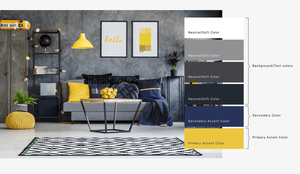
Take a tip from interior design

Utilize shades of black, gray and white, these can be used for text and background colors
Select a accent color to use as your primary color — as this makes layouts easy to scan
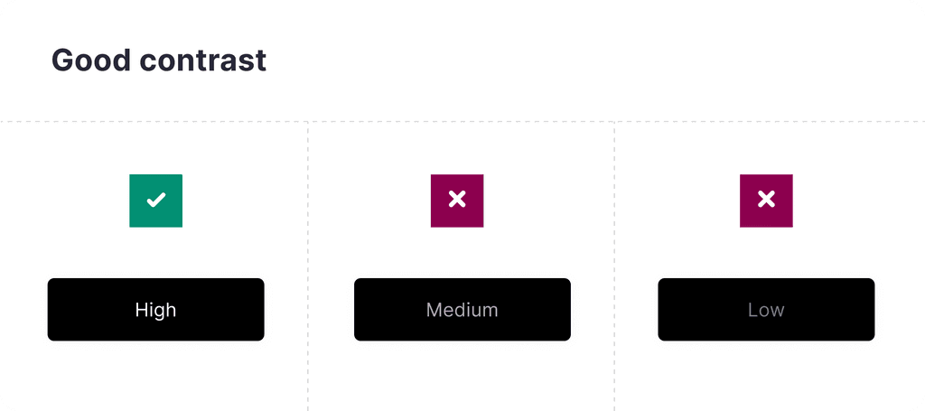
Use good contrast for accessibility — test colors with the visually impaired or use tools to help you
Don't use too many colors — keep is simple and minimal works best
Avoid color combination that can "vibrant" when next to each other
If you use color for a your text, make sure it has good contrast and is legible
Never use color for long paragraphs — decide when and how to use vibrant and soft colors
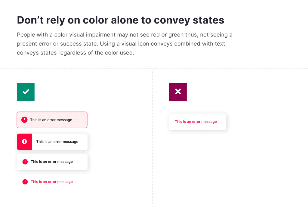
Don't rely on color alone to communicate meaning. Use multiple visual cues to communicate essential states in your product. For example, if you have an error message don't use just red text and expect the red to inform error (people that are color impaired will not notice this) pair your text with an icon to give multiple visual cues.
Use WCAG (web content accessibility guidelines) recommendation, that the background-to-text contrast ratio is at least 4.5:1 — you can test this with the link below


COLOR GENERATION
Color palette creation tools
Coolors.co
Colormagic.app
Colormind.io
Pigment.shapefactory
color.adobe.co
Colors.muz.li